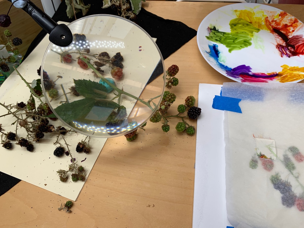
This is not a pretty sight; It is my desk easel at this stage of the painting.
I haven’t disposed of the original stem or leaves, nor the the additional berries used underway. As I said before, once part of the subject is past caring, I replace it with a fresh sample. There have been many fresh samples so far, therefore, although the set-up looks similar, the details are not. You will see even more when I get to the leaves!
But why have I kept onto the old berries? Because, every one is different. The arrangement of the drupelets is different even though they follow the Fibonacci pattern. They also contain different numbers in each berry. I might want that information at a later stage, even though the berries have dried out.
The picture also shows how I check the connections on my plant. Under the magnifying glass is the connection between a branch, a new stem and the adjoining leaf. The sample is in the opposite direction to my drawing, so I need to transpose the information as I paint. It’s no good me turning the stem over as the information is different on the other side.
You can see the developing painting on the right and my refreshed colour palette as well.
This time I will finish the blackberries and make a start on the leaves.
If I had been doing this on paper, I would have used graphite for the leaf right in the background, but it doesn’t look so good on vellum. Its a useful exercise as I will be using something similar when I do my Norwegian plant pictures for my RHS exhibit.
I have been trialling different methods and different pigments. For once I realised that graphite was not good enough for what I needed, I knew I would have find a pigment I felt I could use in a controlled manner. So which pigment should I use? I tried Daniel Smith’s ‘Graphite Grey’ and several natural earth pigments by several manufacturers, but each time the pigment felt too sticky for what I wanted to do with it. I needed to get a consistent fine line and be able to do delicate monotone shading. In the end I reverted to my own neutral grey that I often make using Perylene Violet and Maimeri’s Cyan; the latter is the same pigment as W&N Blue, green shade and works well for me. I can vary the grey from cold to warm and very pale to dark. By the way, the earth colours didn’t look quite right and didn’t recede enough in the background for my liking.
Now the berries. These are the remaining berries that are gradually ripening through red. I love the variation in colours here, but this is one of the areas in which I experienced problems. I will write an additional blog about my mishaps! Suffice it to say that each drupelet is a different colour. I always started off fine, keeping the colour fairly pure to begin with. But then I invariably overworked it to show the different colours. You won’t (I hope) see that on the final version of what you see here, but it is certainly something to bear in mind.
