Depending upon where one lives and picks fruit in Norway, some people are not aware of the bearberry and its identification problems. In fact, initially I had real problems finding an example of the bearberry to draw from.

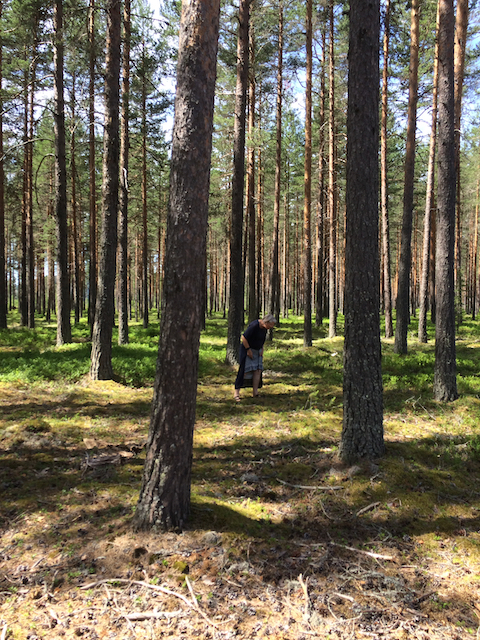
Many years ago I had experienced the misfortune of mixing up the two berries and knew that they could grow in similar locations. But to begin with I didn’t find any near the cottage we had rented. We therefore went on a field trip in the car and drove to an area where I knew they had grown 50 years before. Unfortunately, things had changed, and we found houses instead!
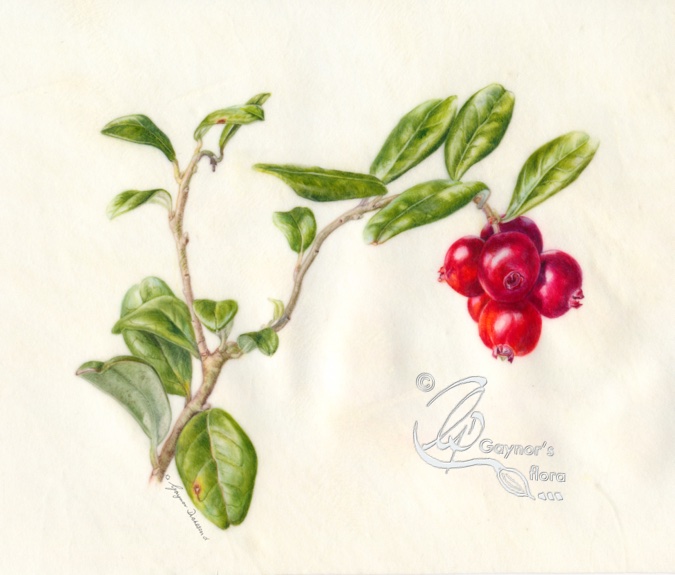
Eventually, in the next valley, we found both bearberry and lingonberry growing together on a sandy forest floor.
The following year in 2018 my poor husband enjoyed a solo 200km return journey to get a sample for me! Fortunately I was using GPS to record the position of every specimen found and he used this to find the forest area.
It was with relief that in 2019 we eventually found some growing very well, close to the main road below our rented cottage up in the mountains. Now I could truly say that all of the plants were from the same area!

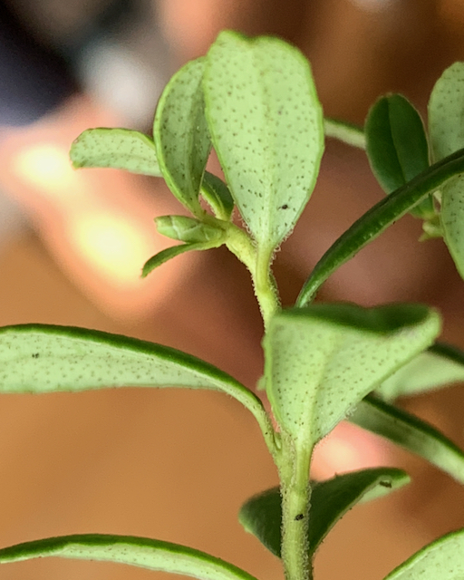
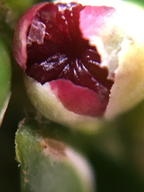
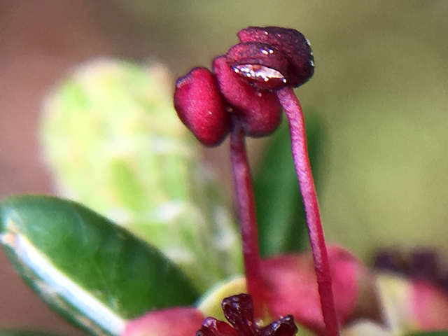
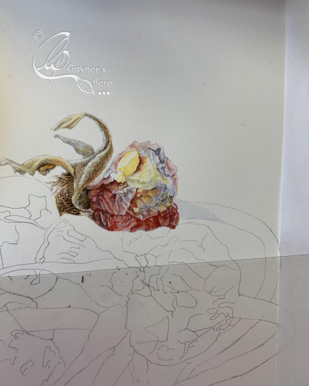
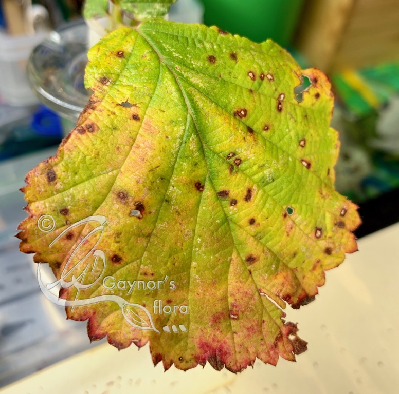
I did quite a few different sketches of this plant and like so many of the plants in this series, found that it often starts setting its buds in the autumn in preparation for the following season.
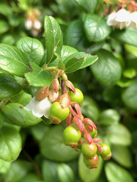
I therefore decided to wait until the following year to try and get an immature fruit. As it happens, I had to wait four years until I could get a sample at the right level of maturity. But at least I managed it and got some good detail.

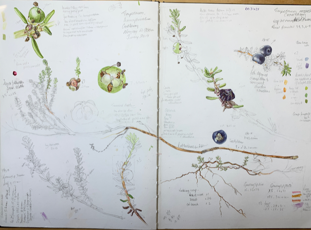
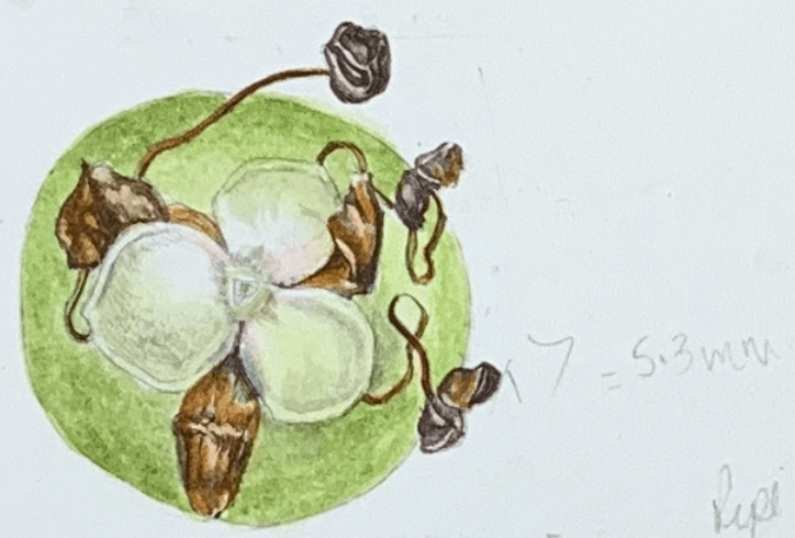
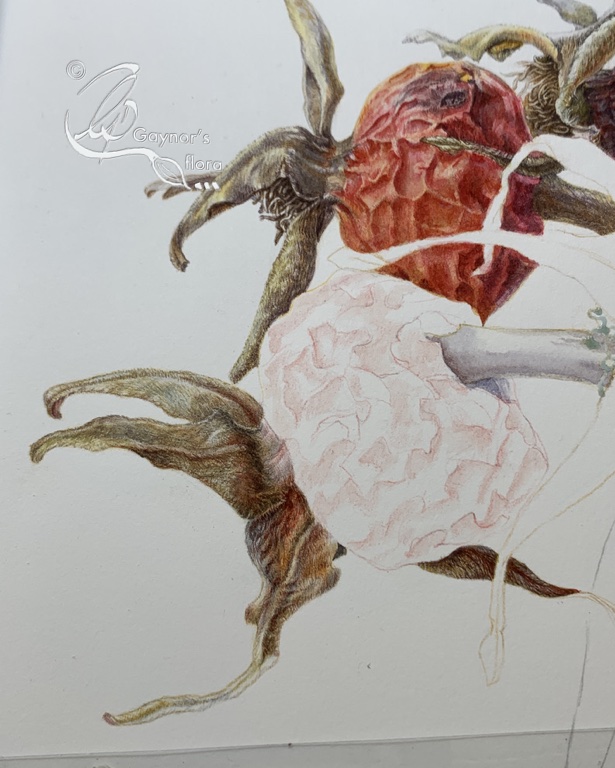
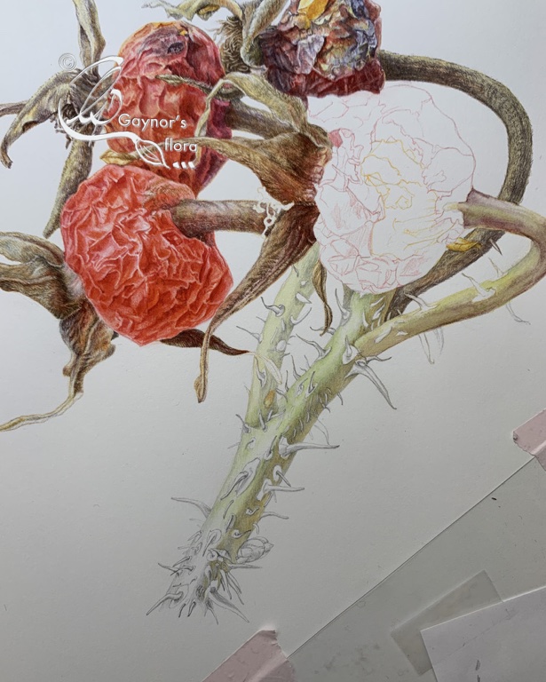
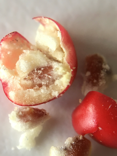
But I think one of the biggest headaches when collecting information was doing a transverse section (TS) of the fruit. The fruit contains relatively large hard seeds, as it is a stone fruit. Carrying out a LS on a ripe fruit was simple as I had no need to cut through any seeds.
But the TS was another kettle of fish! Each seed was about 2.3 mm long and very hard. There was no way I could cut through this without crushing the whole fruit and destroying the chance to draw this section as I had for every other picture.
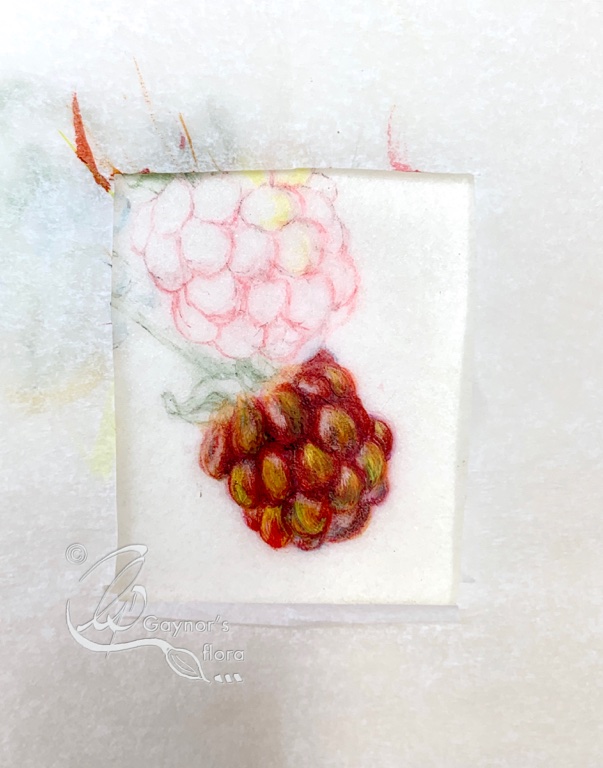
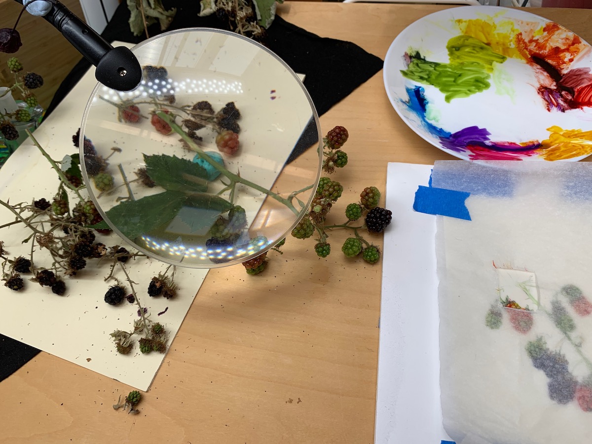
My trial piece on vellum helped me with my colour decisions for the final artwork. I started the sketches in 2017 and in June 2022 I started the final piece, finishing it in October 2022.


Main branch outlined from sample branch 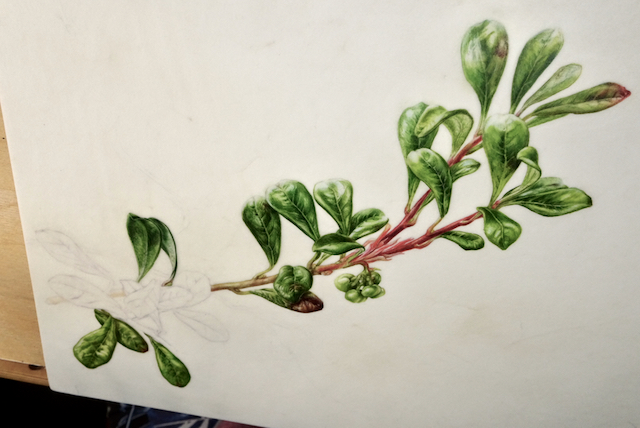
Main branch almost complete. x 2 natural size. 
Graphite tracing for natural size branch 
Graphite shading 
Graphite and wash 
Graphite and wash section complete.
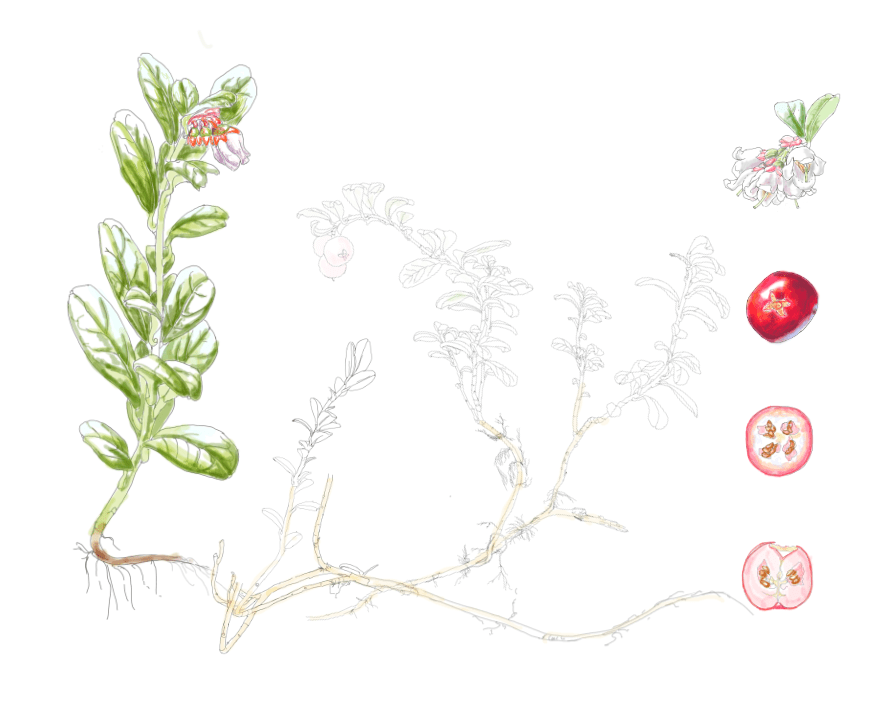
The native range of this species is Subarctic to N., W. & Central U.S.A. including the UK and Norway. It is a subshrub and grows primarily in the temperate biome.
Source: Kew – Plants of the World Online
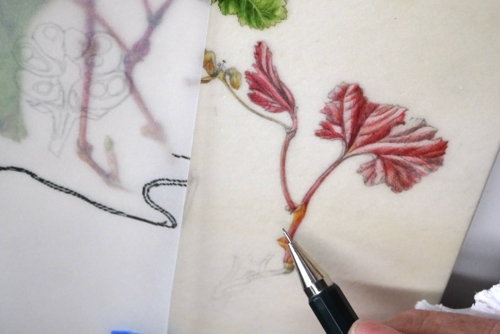
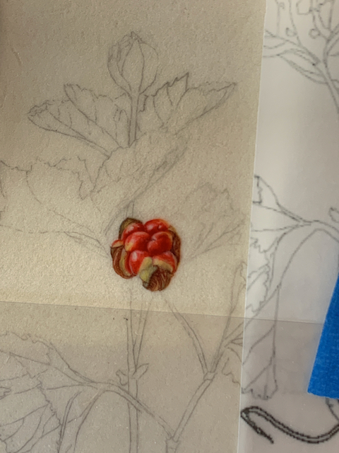
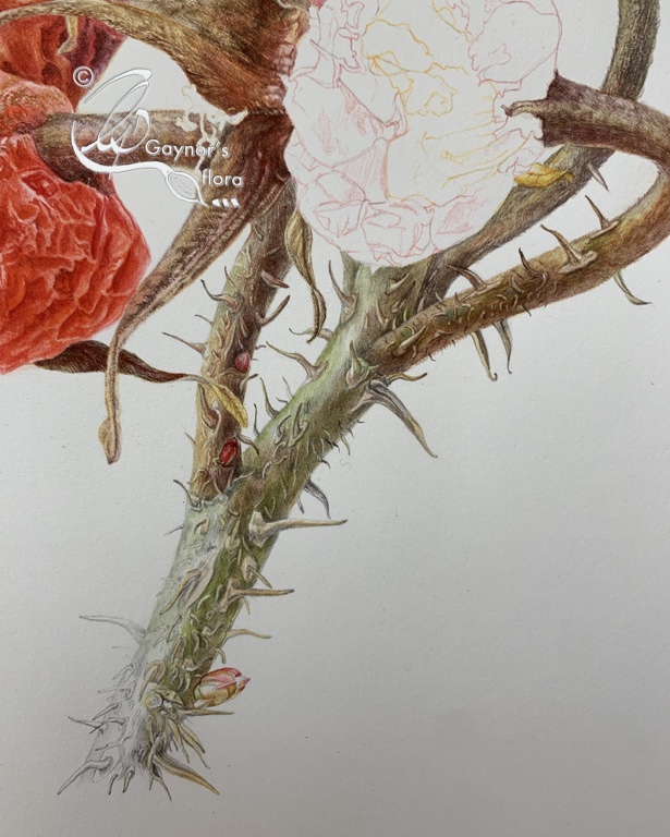
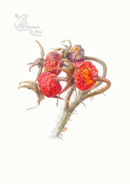
The photos above are a quick reminder of my process for this series. The various elements are traced to the vellum block and sometimes I go over these with a non-permanent watercolour outline. The main branch has generally been completed at twice the natural size and the sections in graphite or graphite and watercolour wash are normally natural size to show habit. Graphite is used to allow these sections to fall into the background making the overall picture less heavy.
Bearberry leaf tea infusion
Pour 150ml of boiling water over 2.5g of finely chopped or coarsely powdered, fresh or dried bearberry leaves and strain after 10 to 15 minutes. If you want to keep the content of tannins as low as possible, prepare a cold-water maceration. To do this leave the leaves in the cold water for 6 to 12 hours, then strain and heat the tea.
Uses
Inflammatory diseases of the urinary tract – NOT KIDNEY problems – “if treatment with antibiotics is not necessary.” Bearberry leaf infusion is classified as traditional herbal medicinal. Based on many years of experience, bearberry leaves can be used to treat symptoms of recurrent cystitis (e.g. burning sensation during urination and/or frequent urination in women), if there are more serious causes or symptoms remain, seek medical attention.
Tea infusion: drink a warm cup of bearberry leaf tea up to 4 times a day;
See https://arzneipflanzenlexikon.info/en/bearberry.php for more information.
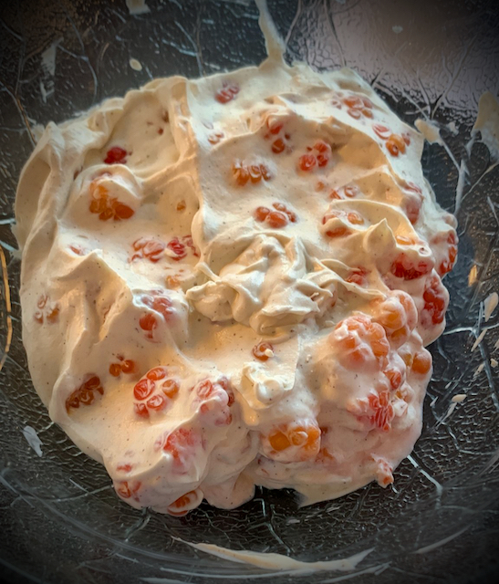
Bearberry preserve
Ingredients:
- 2 quarts bearberries, rinsed and without stems
- Sugar (see instructions for amount of sugar)
- 1 teaspoon lemon juice
- 1 package pectin (about 3 ounces)
Instructions:
Put the berries in a pot and cook over medium heat until soft; about 5-10 minutes. Crush the berries, then run them through a sieve or cheesecloth to remove the seeds. Retain as much of the pulp as possible.
Return the juice and pulp to the pot, adding one cup of sugar for every cup of juice and pulp. Add the lemon juice, mix thoroughly, and heat to a boil.
Boil for a minute or two, then stir in the pectin. Allow the preserves to cool and set.
My last blog about this series of pictures is scheduled for 15 June 2023. It is the day we get the results of the RHS judging, so I hope to include my result. I will show the final pictures which I have been keen to conceal until the judging process is complete.