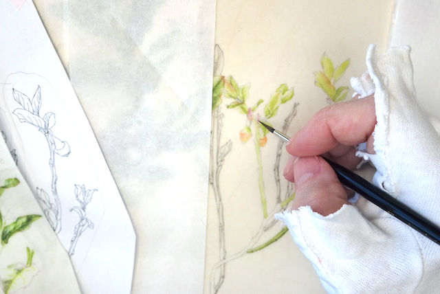
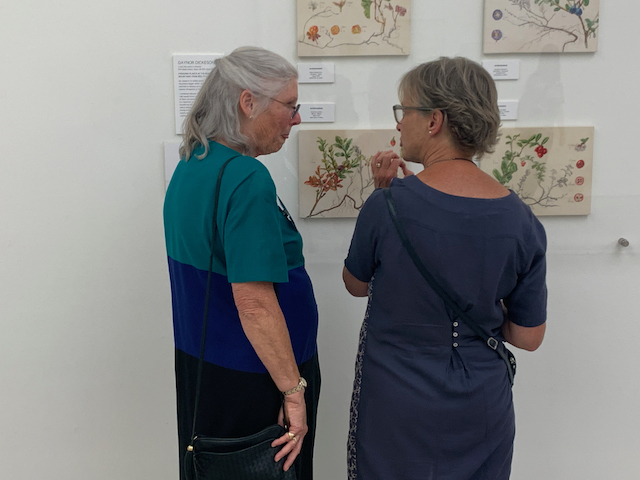
When the above picture was taken I had absorbed the judges feedback from a few hours earlier.
I had travelled from Norway the night before the exhibition and as soon as the plane landed I was able to access my emails. One of them was from the RHS telling me the results of the judging – a Silver Gilt award.
Before being invited to exhibit with the RHS one has to have ones work assessed by a panel of judges. The work, several pictures, needs to be of a consistent silver medal level.

If one is awarded a medal at the exhibition (this is not guaranteed), it is one of four in this order of merit:
- Gold
- Silver Gilt
- Silver
- Bronze
I, like everyone before me, hoped that my work was worthy of a Gold medal. It was not to be this time.
But having not got a Gold I can happily comment that this prestigious exhibition is international and the best artists from around the globe take part hoping to win this coveted award.
I don’t have photos from the morning or afternoon sessions at the Saatchi gallery, but I was kindly and quickly nabbed as I arrived before lunch by someone who had taken the time to study my exhibit and wanted to understand my award. I was glad of this as it helped prepare me for my feedback due in the afternoon as the assumptions were correct.
Well what about the feedback?
Luckily I was well prepared.
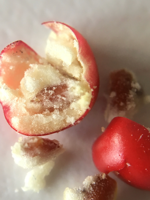
I was extremely lucky as I was afraid that the judge(s) might not know my subjects. This was not the case as the judge given the task of my feedback had studied one of the species and had ‘gorged’ on most of the others! Apparently, my paintings were so convincing as to want to pick and eat them!
Therefore, it wasn’t the technical skills or quality of painting that was an issue.
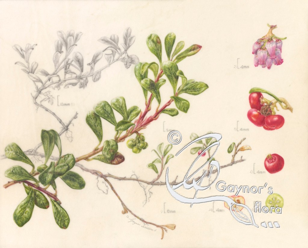
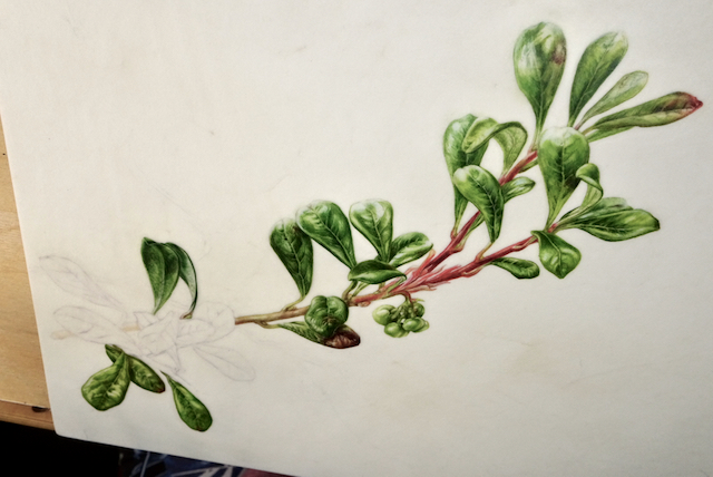
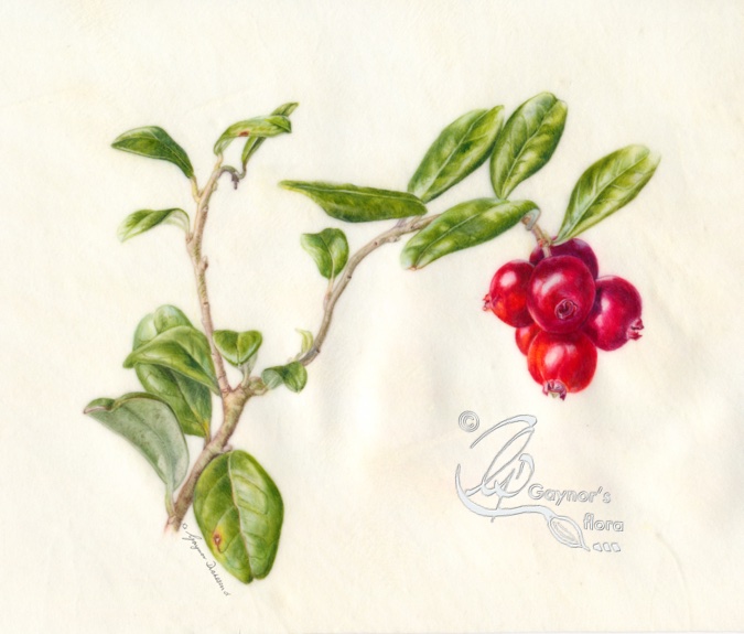
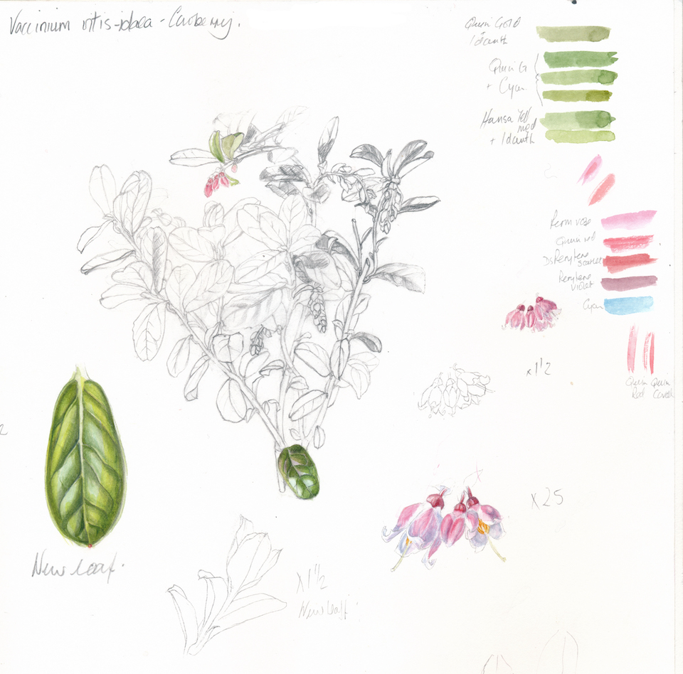
Botanically, I was told that there were no holes in this area and they liked my use of graphite.
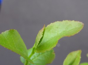
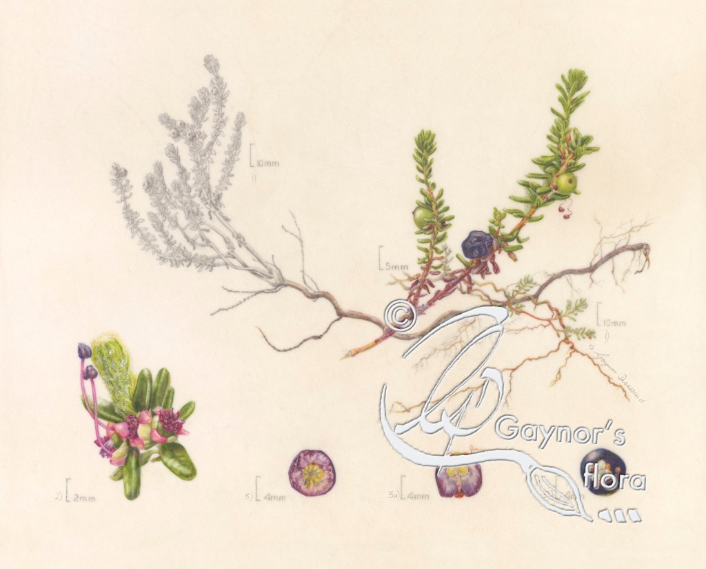
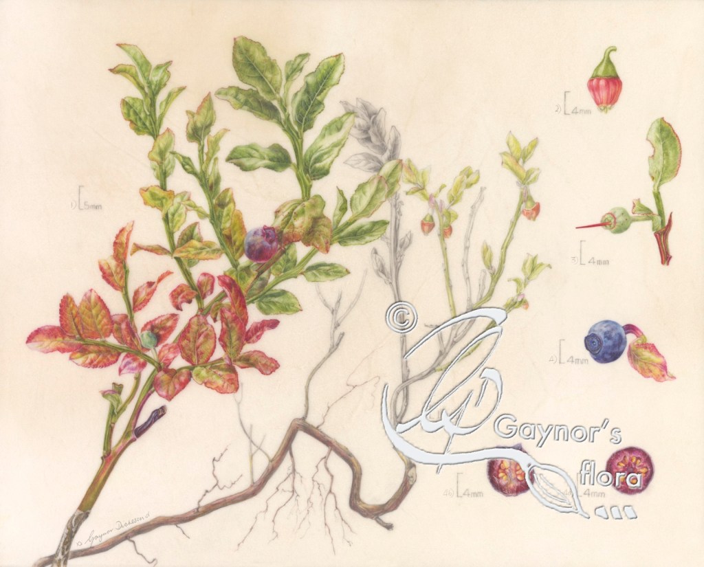
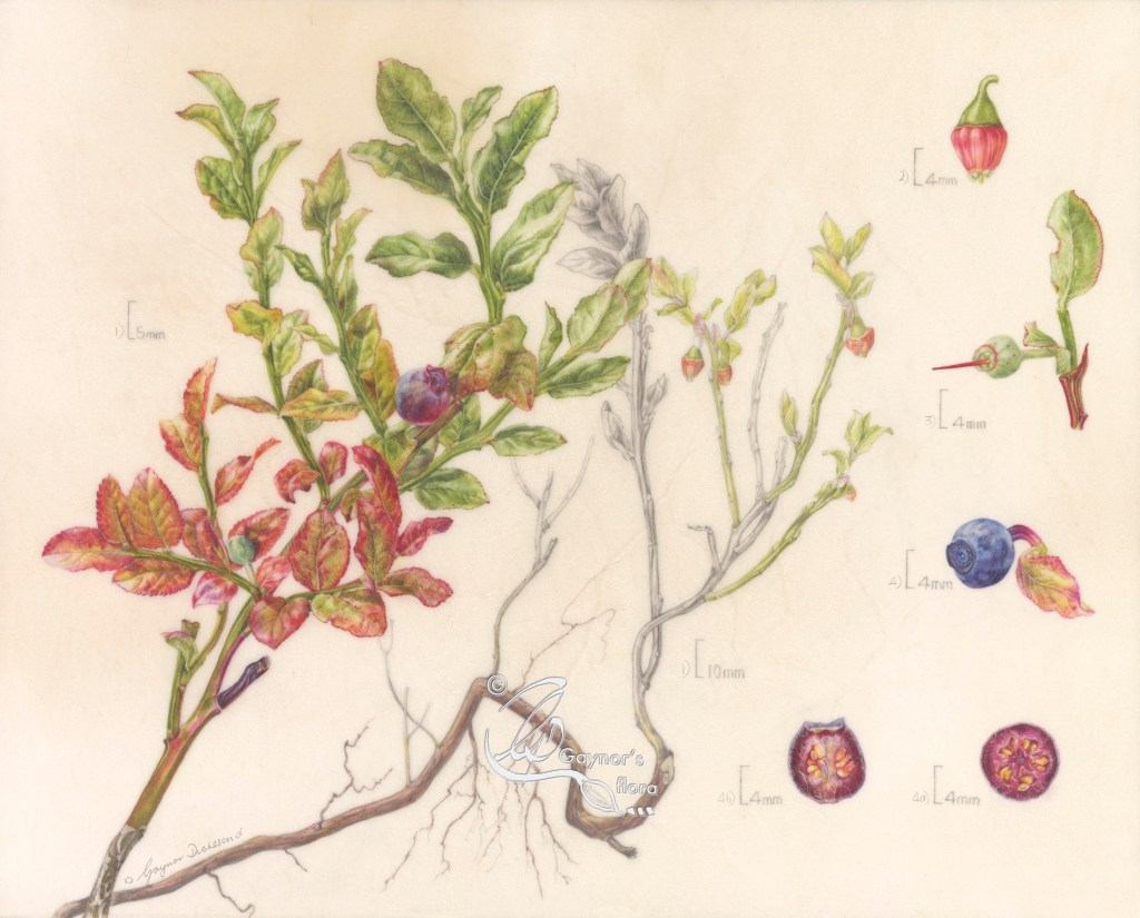
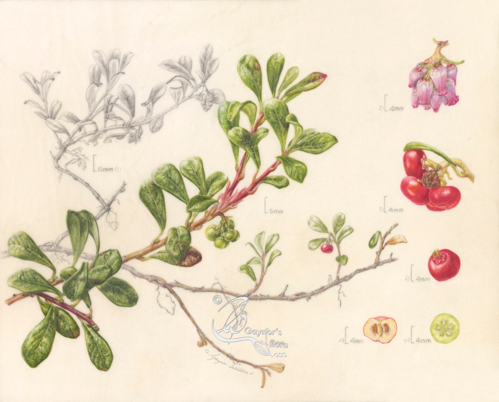
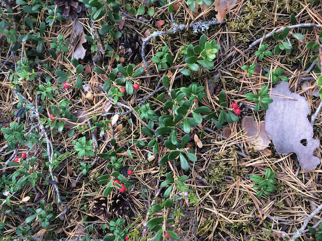
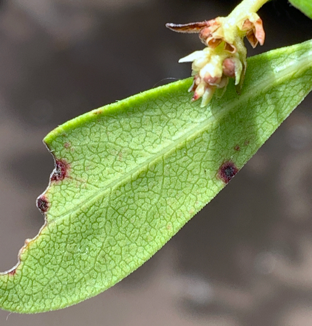
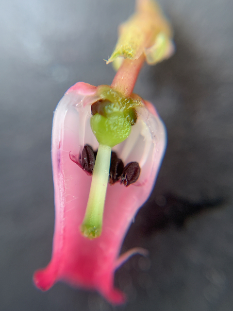
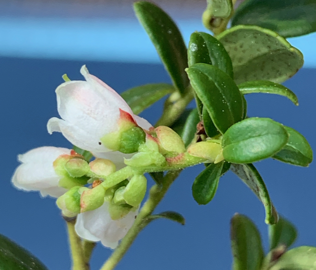
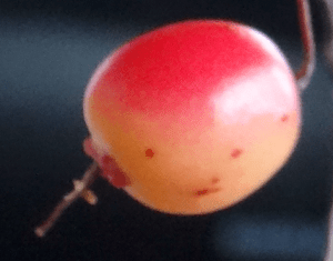
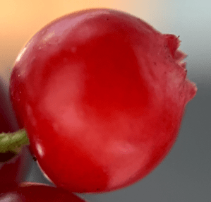
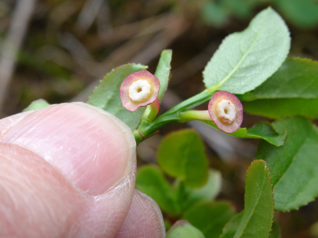
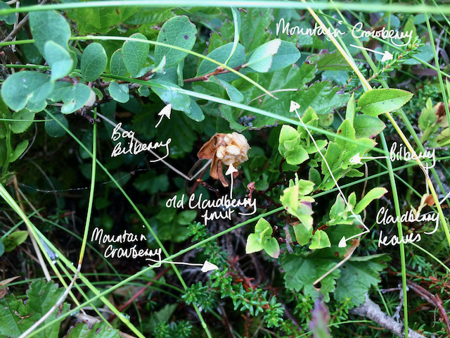
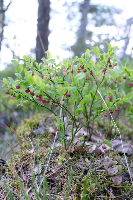
One of the judges had queried the nature of my Bilberry leaves as they thought them a little ‘wavy’. I commented that particularly young leaves are quite thin and often the edges were of a rather wavy nature.
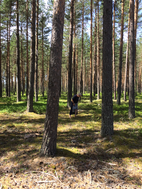
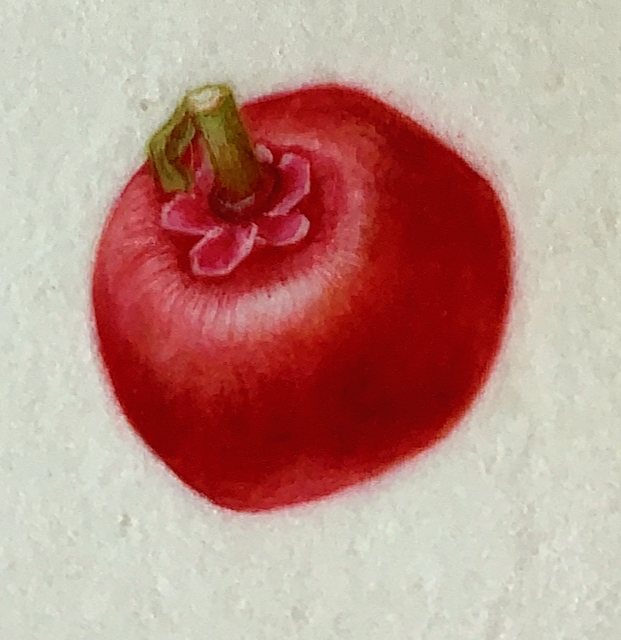
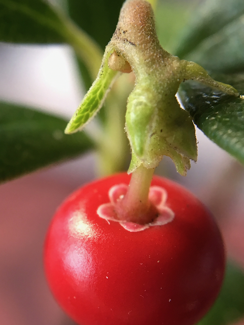
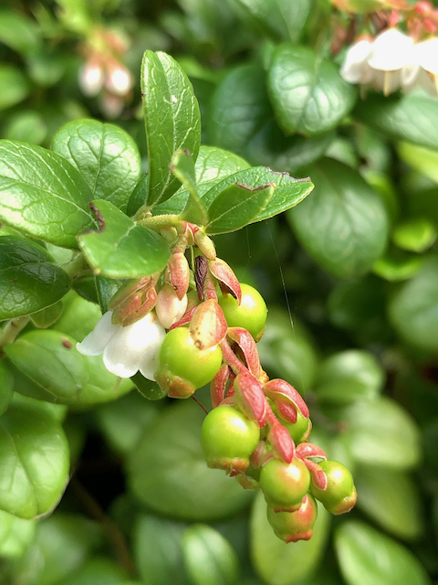
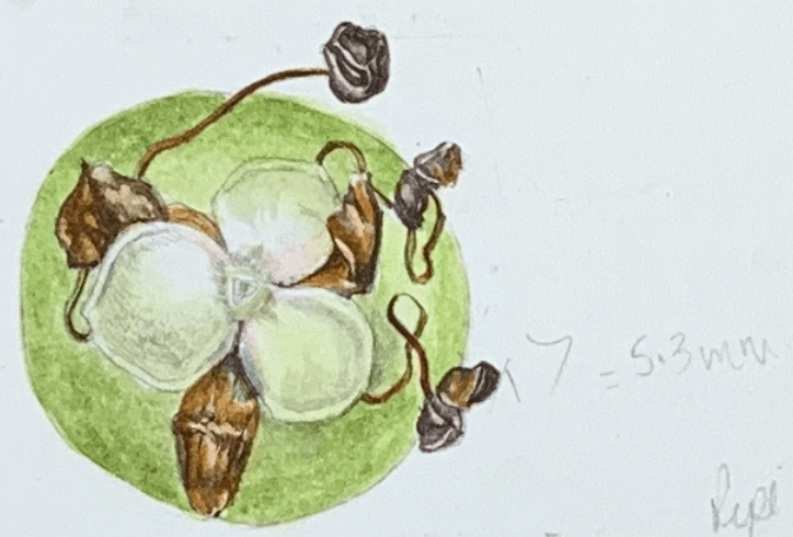
Another query had been why I had chosen to paint on vellum rather than paper. I was readily able to say that the colours of the tiny fruit in the mountains are so intense that the way colours are reflected off vellum truly justifies that choice of support.
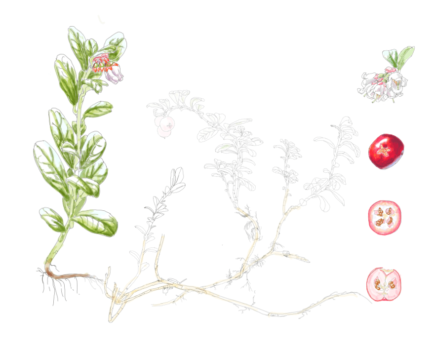
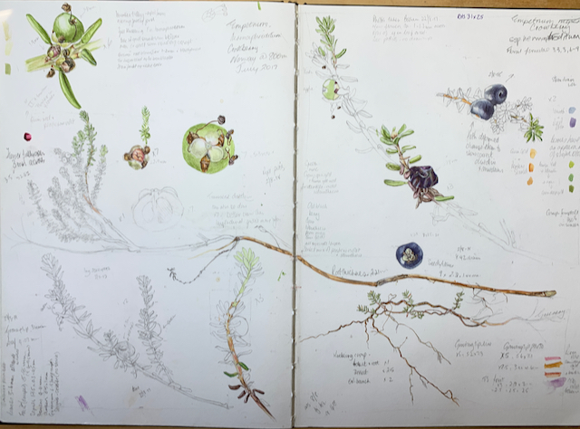
However, it seems that the issues the judges had with my pictures were my scale bars – again. It was my scale bars that were the issue in my last exhibit in 2014. But this time it was slightly different. Apparently, it was felt I had too many of them and that they had a tendency to dominate the picture making them intrusive.
I was told that the ‘judges decision was not unanimous and that there was gold in there’.
The judge who gave me the feedback felt that with the present exhibit format I was rather ‘hamstrung’. To explain that a little better, this was only in the way I had planned by exhibit without knowledge of the labelling restrictions now in place. I don’t know if I had missed some information sent out previously from the RHS, but as my exhibit took six years to prepare, plan and paint, things have changed as one would expect.
The way an exhibit is hung including the information given about each picture is the ultimate responsibility of the artist. This includes scientific names and common names used and their spelling. Previously, labelling included information about the species referring to parts on the picture. i.e. dissections were described in the legend and there might be additional information of interest. As such I wouldn’t have needed so many scale bars on each picture.
But now there was one overall description of the exhibit with the limitation of 100 words, plus an individual label giving the plant name.
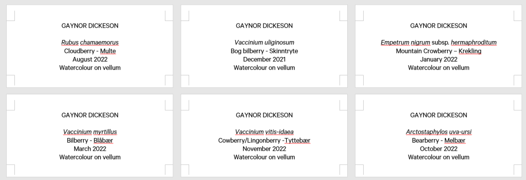
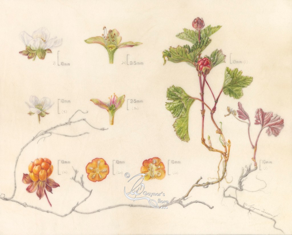
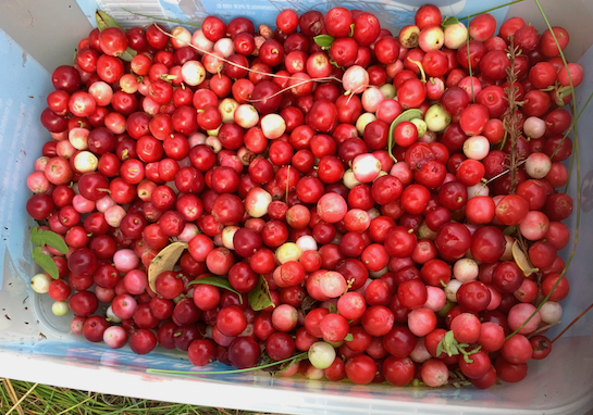
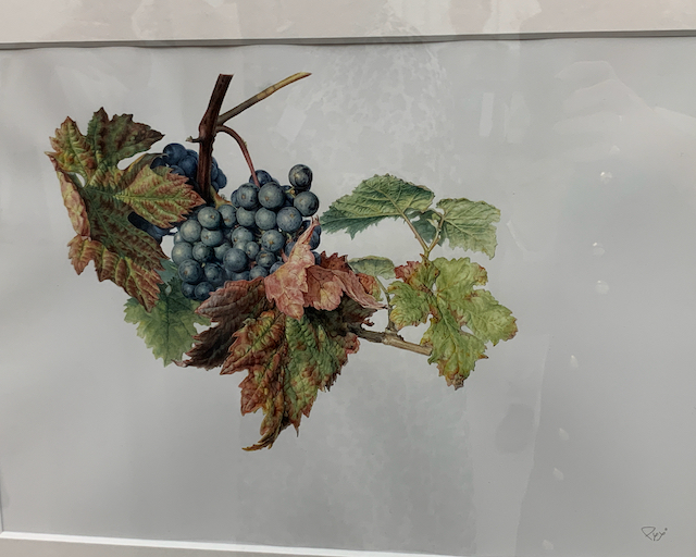
If one is looking at scale bars as a negative, this picture was probably the worst one!! I had three different sizes on the picture; the actual size of the plant to the right, the berry, dissection of the berry and whole flowers were the same enlargement and the dissections of the male and female flowers were enlarged further. Unless this distinction is made, no-one would actually understand that they were different sizes.
As it was, there was nowhere to inform that this fantastic species had separate male and female plants, therefore it also had separate male and female flowers! Furthermore, I was unable to show that the plant grew well in boggy areas.
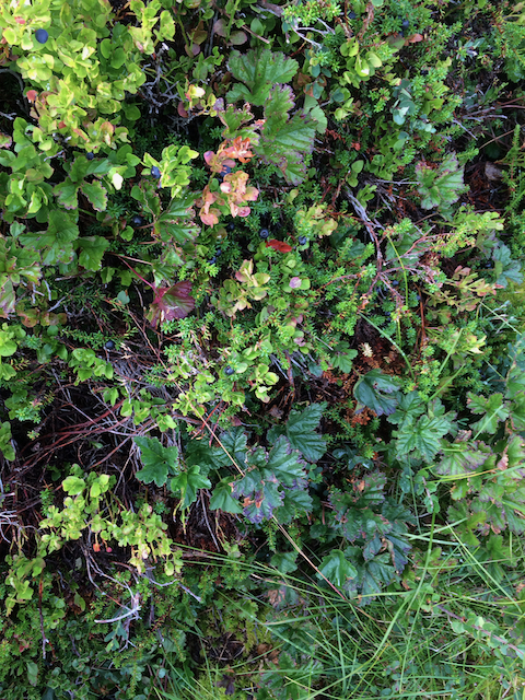
The name of my exhibit included the phrase ‘ from bog to sand’. There was no indication in the exhibit that the six species grew in either sand or boggy areas and there was no room made to do so either.
Although my scale bars got in the way of the judging process, I was told that each of the pictures were valuable pieces of documentation.
How do I feel about this experience?
I have to say that overall it was fantastic. It wasn’t the same as previously where there was a special relationship between the exhibiting artists who put up their own exhibits – keeping their fingers and toes crossed that nothing would fall down. But it was different. We still developed good relationships as we were all in the same boat and just as unsure about ourselves and our work as we would ever be.
Thinking only of the exhibition and the run up to it, it seemed so well planned and disciplined. There was proper project management and information from the artists was needed in a timely fashion. We weren’t left in the dark about anything. What the RHS and the Saatchi Gallery wanted from us was clearly explained and they did their best to give us what we needed within the boundaries they had set. As an example, except for my pictures, all were on watercolour paper and needed to be framed with a mount. Right from the beginning I had asked for mine to be mounted behind perspex so that the whole vellum mounted block was visible. They did an absolutely beautiful job of this and for me this aspect of the exhibit was perfect.
The feedback from the judges was carried out in a sympathetic way. We were seated in front of our exhibit during this process and as far as I am aware no-one else was in the same gallery at the same time.
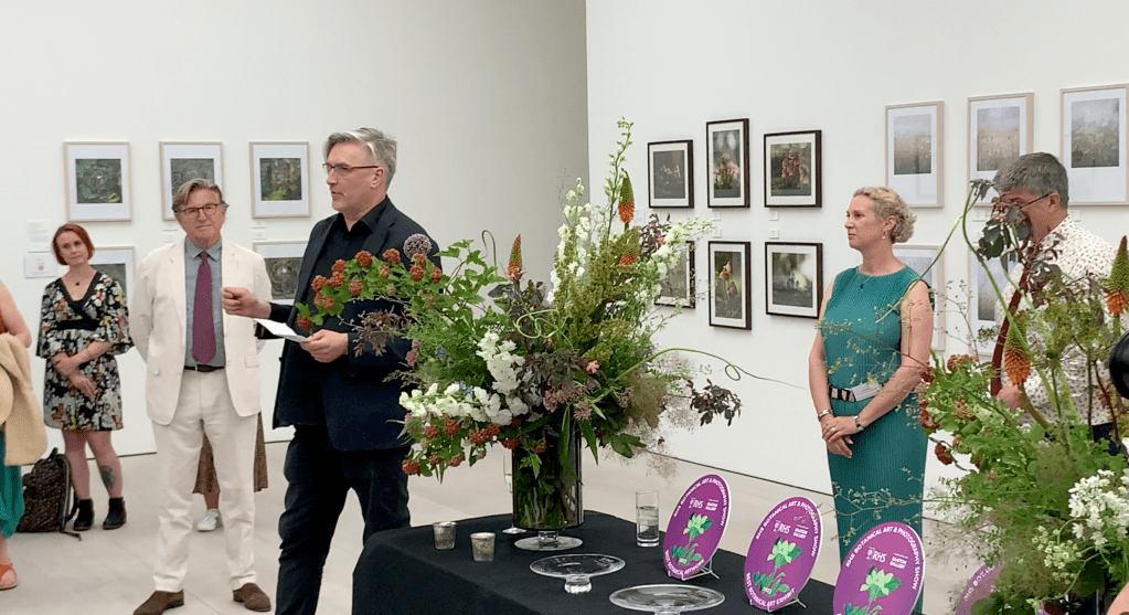
The preview was also done very well with speeches and the delivery of special awards.
Will I do this again?
Absolutely! But although I love tiny plants and dissections to discover the hidden life of the plant, I might actually keep it a little simpler next time!


If you have seen the exhibition, do let me know what you think of it. And, If you have any queries about my previous blogs on the series of paintings or about my experience, also get in touch. I look forward to hearing from you.