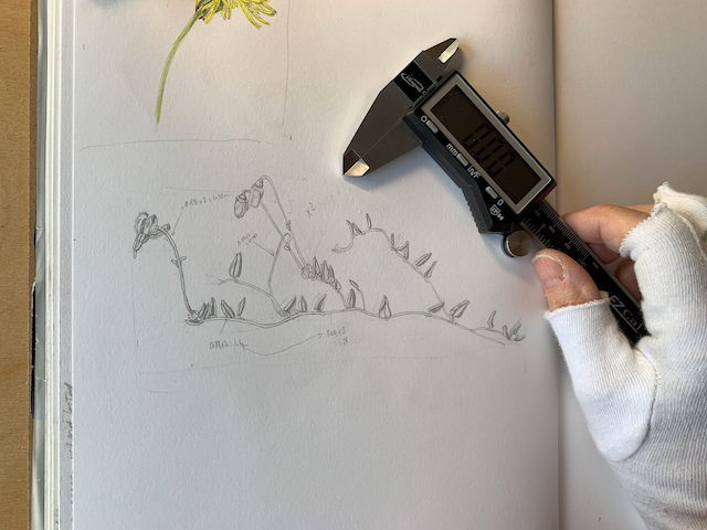
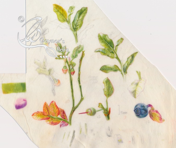
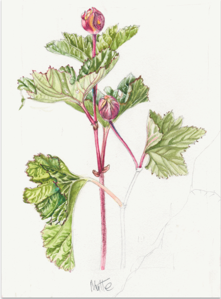
This is the main double page for my sketches done on the Bilberry plant. I try to keep as much information as possible together so that when I do my final work I don’t have to search too much in the sketchbook. I try to find a hole on the relevant page to add things, either more sketches or research I might have done. I often find that when I am researching on the internet, the gaps are usually left along the bottom edge of the page, so I frequently use this area to write any notes.
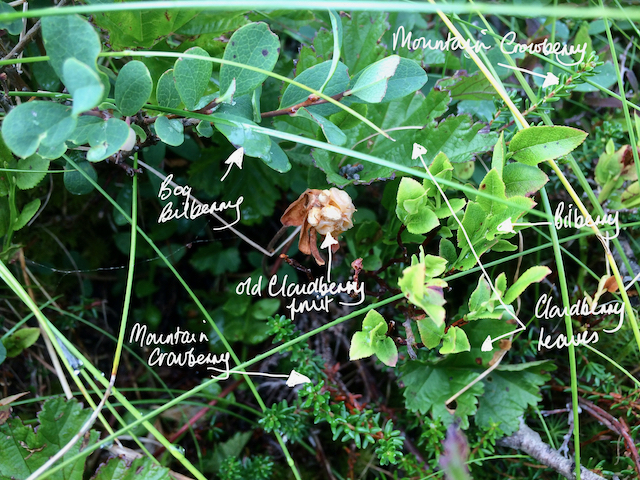
As I have already mentioned in the previous blog, there is a similarity in the fruit of the Bilberry and the Bog bilberry, but the stems are very different for starters. The Bilberry stems are very angular and last year’s branches remain green over winter and into the next season. The deer seem to like them and paw away the snow eating the shoots. The Bog bilberry stems are brown and woody; I talked more about this plant in the blogs published 14th and 18th May.


By the middle of 2020 I felt that I had enough sketches for most of my final pictures and had already decided to stop the extended period of ‘productive procrastination’. We were in the middle of the pandemic and for most people, the world had turned upside down. My daughter, living in Norway, felt we were too old to live on our own any longer and she was too far away should anything happen to us.
The decision to move back to Norway was thought about and made quite quickly. I think we started talking about it mid June and sold our home with the large beautiful garden and the ‘shed’ – my studio, quite quickly.
The actual move came in August 2020. I had planned all my compositions before leaving the UK and when we arrived in Norway I was all set to start painting the final artwork.
I won’t talk about all the problems moving during a pandemic caused – we were lucky to be completely healthy. But some of the benefits from moving back to the country I loved included being much nearer to the plants in my series. There were lots of others, but I leave that to your imagination.

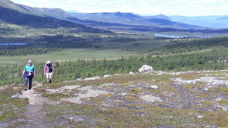
In between looking for a new home and sorting out all the official stuff and additional problems caused by Brexit, I started working towards doing the first picture. Of course, it had to be the Bilberry. This plant also grows at sea level and was easy to access now.
I only had to walk up into the woods behind my daughters house where we stayed until we finally moved. There were lots of native plants along the tracks, including loads of Bilberry. In our new home, to which we moved in January 2021 when the area was ensconced in snow, we eventually found it contained a lot of Bilberry plants. Heaven or what!?
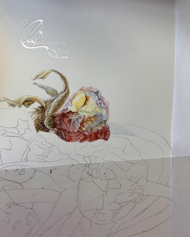
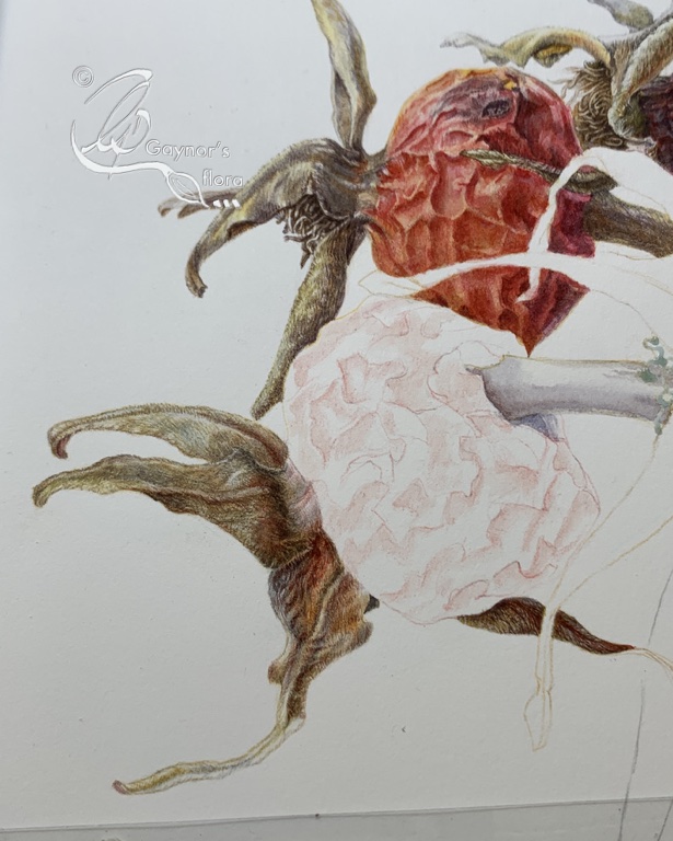
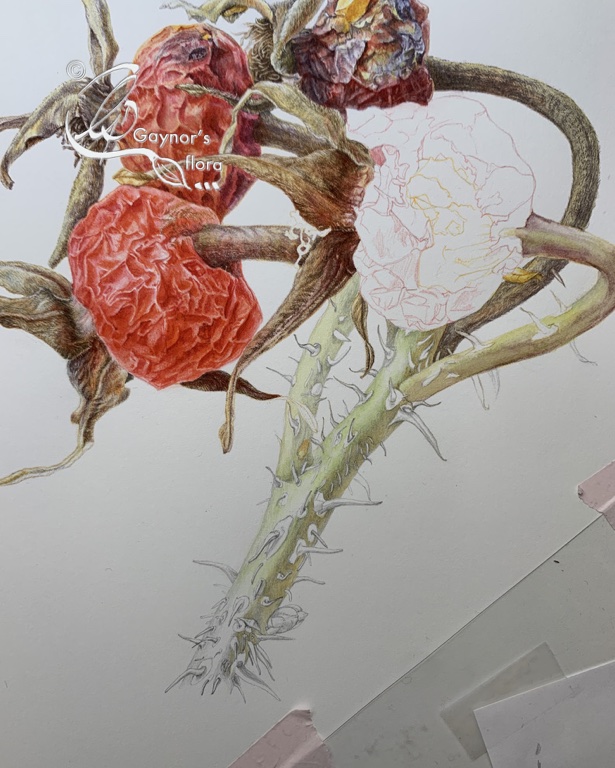
I started with a trial piece of Bilberry parts on vellum and began the final artwork in June 2021, finishing March 2022.
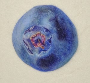
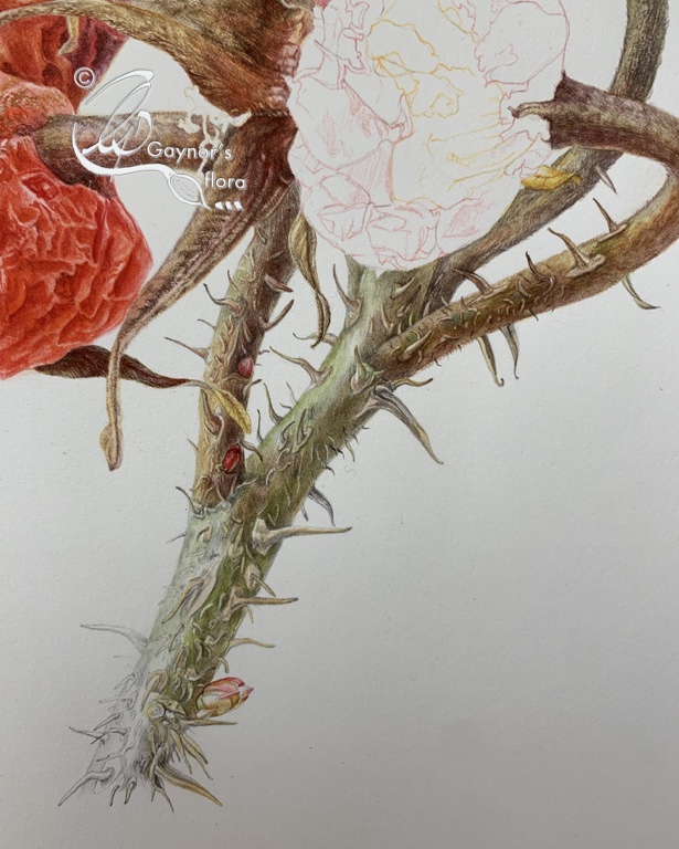
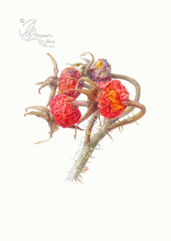
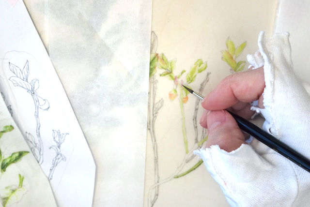
You can see my work station in our new home below. As is perhaps obvious, I continued to procrastinate a little longer as I just had to do more sketches. Working on the vellum off-cut was extremely useful as I also tried out various methods of introducing graphite. Getting the colours right for the bloom of the nearly black fruit whilst I had them was also important. Painting this on paper had been a completely different kettle of fish!


Making sure that I had samples from all the plants in the series at the right time of year was like putting together a puzzle. The flower sections had to be done in the spring and the fruit at various times over the autumn. Leaves also changed through the seasons.
But basically, I knew that I had roughly six months of the year to paint the deciduous plants (Bilberry, Bog Bilberry, Cloudberry) and those I didn’t have access to under the snow such as the Cranberry. For the remaining plants I would be able to get leaves throughout the year as long as they weren’t hidden too deeply under the snow. It became a matter of planning and making sure I knew where relevant plants were over the winter.
The native range of this Vaccinium myrtillus is Greenland, Temp. Eurasia, W. Canada to NW. & W. Central U.S.A. It is a subshrub and grows primarily in the temperate biome. Including both Norway and the UK.
Source: Kew Plants of the World Online
Mor Astrid’s (my lovely grandmother-in-law) Raw Bilberry squash
3 l Bilberries
2.5 l water
75 gm Cream of Tartar
4.5 kg sugar
- Rinse through the berries to clean of soil. They don’t need to be thoroughly cleaned of leaves and small stalks.
- Bruise/crush berries in a plastic bucket and leave for 24 hrs.
- Mix the Cream of Tartar into the water and add to the berries. Stir thoroughly.
- Let the mixture stand for 24 hrs.
- Strain through a muslin.
- Add the sugar to the strained fluid.
- Stir thoroughly until the sugar has melted in.
- Pour into bottles.
The resulting squash can be mixed with water. It is DELICIOUS.
Keep out of easy reach of children or it will be finished off in no time!!
A suggestion from Polly o’Leary after the Bilberry part 1 blog. Thank you Polly.
In this part of Wales theyre called Whinberries. We used to make them into whinberry and apple pie, or whinberry jam. Or both. Depending on how many we found. No recipes, except the usual – plain shortcrust pastry, not too much sugar, because they’re lovely and tart.
Same with the jam. Never really thought about a recipe, just made it the usual way as they were such a treat.
This came from Jane Hogan following the Bilberry part 1 blog. Thank you Jane
We used to pick bilberries on the North Yorkshire moors when visiting my grandmother. She used to line a pie dish with pastry, pile in the bilberries with sugar and top with another layer of pastry. Served with custard or cream and eaten hot. There wasn’t usually any left to have cold! It used to take ages to pick the bilberries. (A quick look online suggests a pound of bilberries and four ounces of sugar)
On 4 June 2023 I will publish the first part of the Lingonberry blog.