Foraging plants in the Norwegian Mountains – 1. History of the project.

I am originally English but have lived many years in Norway with a 24-year gap in the UK from 1996 to 2020. I lived in the valley of Sigdal for several years, just below Haglebu so returning to the area for this project was a joy for me.

Following my application to exhibit at the Royal Horticultural Society (RHS) Botanical Art and Photography Show this year (2023), I received confirmation that I will be one of the exhibitors and allowed to show six pictures in a series of my own choice.

Picking Lingonberries

The topic I chose is the one mentioned above, Foraging plants in the Norwegian Mountains. This series of blogs is about my whole process from choice of plants to painting the final pictures. I intend to post the blogs twice a week right up to the 2023 exhibition in June.

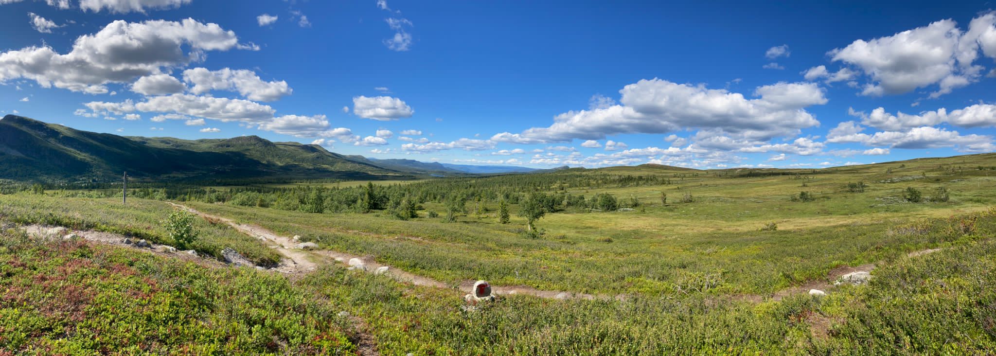
Typically, many Norwegians forage for fruit during the summer and autumn periods of the year. This is understandable when you think that in many parts of Norway the upper metre or more of the ground is frozen solid and covered with snow for up to 6 months of the year. From late May until late September the Norwegian flora has a very fast and compact growth and development. If you come to Norway during the late spring or summer, everything seems very lush with lots of spring flowers everywhere.

If you travel up into the mountains, the flora is different but still very lush – as you see in the pictures above. 

Spring seems to start off with the birch (Betula ) and we love to see the ‘mouse ears’ showing in May. The Norwegian national day is 17th May and being able to decorate everywhere with ‘mouse ears’ really gives the feeling that warmth and growth is at last on the way.

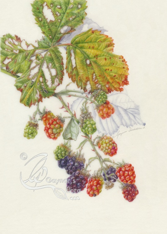
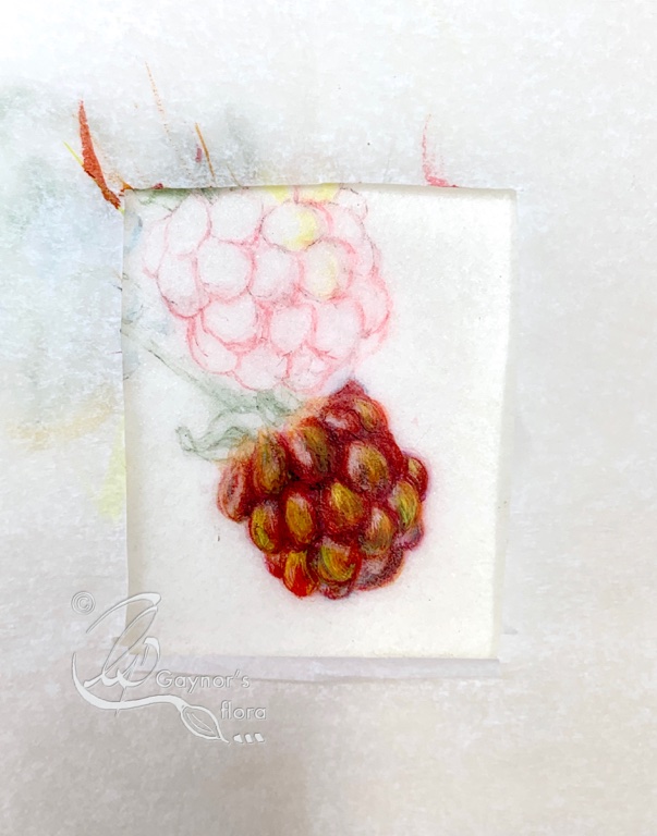
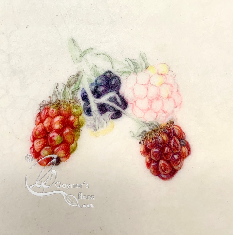
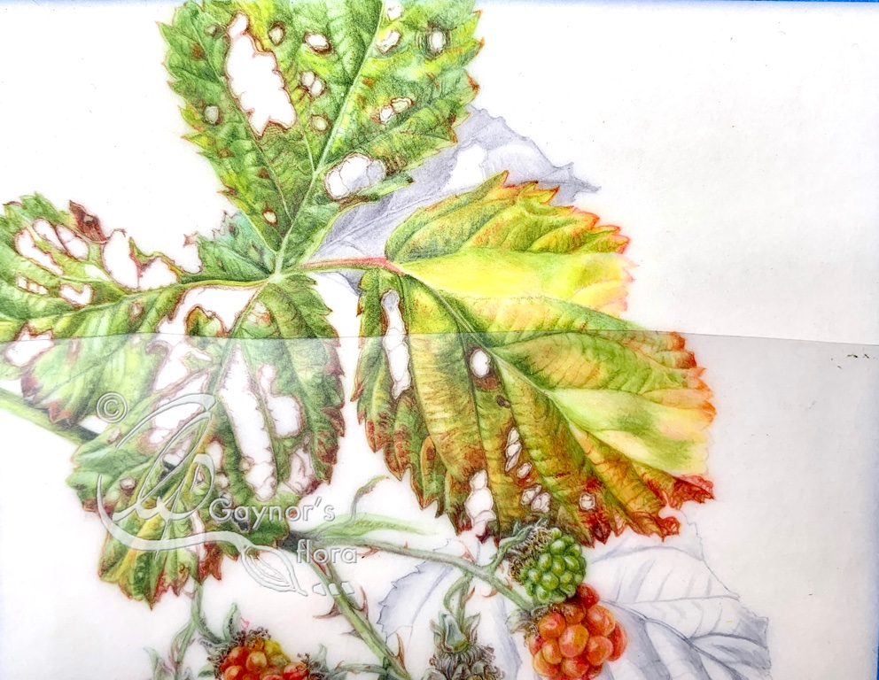
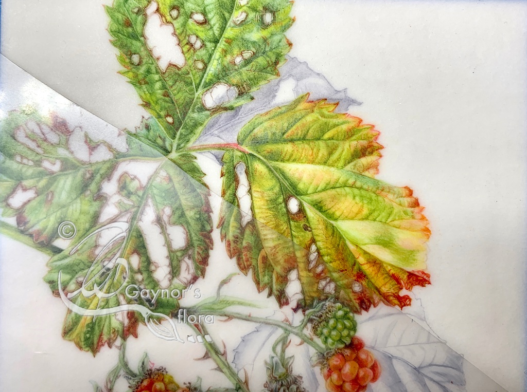
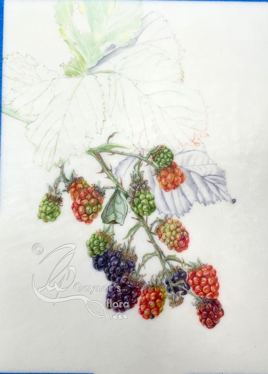
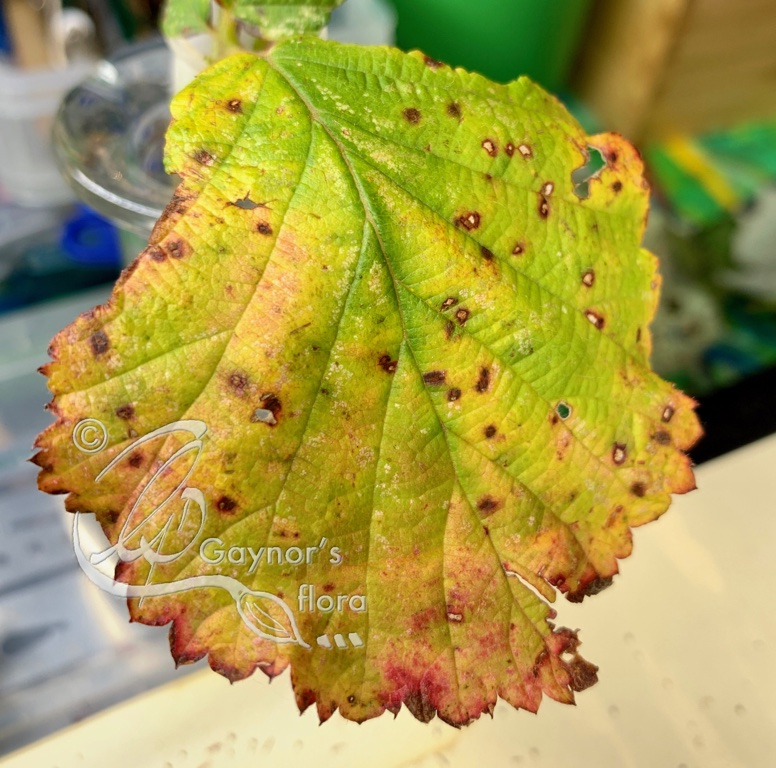
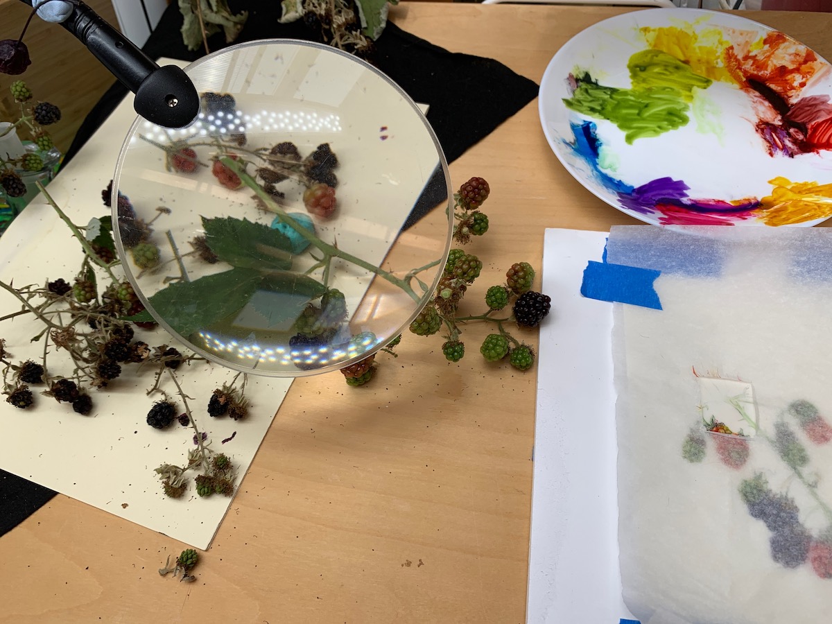
One of the reasons I chose foraging in the mountains as a topic was because I always knew that there were differences in the fruit we found, but it wasn’t until I started painting botanically that I understood how to note these differences and the importance of doing so accurately. 

When I first arrived in Norway in the early seventies, I quickly learnt which fruit was good and very roughly the type of area in which I would find it. I then learnt how to use the various fruits for jam, juices and puddings, giving the family a taste of summer over the winter months.

Now I have the freezer full of bilberries, cloudberries, cowberries (or lingonberries), wild cherries as well as the usual fruit from the garden such as red, white and black currents and plums.

A red Bearberry
Red lingonberries

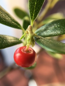
When foraging, there were two fruits that were easy to confuse, but I learnt to distinguish between them, although not via botanical knowledge. I have since discovered that both are safe to eat, but not equally pleasant. They have  completely different uses which, I will come back to in a future blog when describing them.

Both fruit are red and there is a similarity to the leaves, making it a little complicated when picking them – unless you know what to look for. The one to the right has many uses in jam and juice, whereas the one to the left is a stone fruit of which mostly the leaves are used.

What made me choose these plants to study?

In 2014 whilst still living in the UK, I came to Norway to run and teach at a botanical art workshop in Åsgårdstrand, a popular sailing village near where I now live. Edvard Munch lived in Åsgårdstrand when he painted The Scream. 

I will continue this blog on Thursday 23 March.

The Blackberry on Vellum ‘take-outs’

The finished ‘Autumn Blackberry Branch

This blog is about all the mistakes I made whilst painting the Autumn Blackberry Branch on vellum. Above is the finished piece.

Since I started working on vellum I realised that there is a huge difference when working on the different types. This applies both to painting on the vellum and the ability to take things out.

From watching some artists who paint on vellum, they always seemed to use pumice to prepare the vellum. But each time I used this and however gently, I found it more difficult to paint on the surface afterwards and therefore to get a nice smooth result. Even when cleaning up after a mistake, I found it very difficult, but thought this was me!

Early in the year I did a workshop with Denise Walser-Kolar and the first thing she said was that vellum bought from Cowley’s in the UK, is so well prepared that it doesn’t need any preparation; i.e. no need to go over it with pumice.

The biggest difficulty is conveying grease from your hands if you handle it too much. But think about it; one doesn’t handle art paper either if one wants a good result, so why would one need to handle the vellum any more?

Just this little bit of advice has made all the difference to me. Not only do I try to avoid mistakes(!!), but if I do make one I am as gentle as possible with moving the offending pigment.

I will be painting on natural vellum when I do my RHS series and it is definitely more difficult to remove some pigments from this, than to remove from Kelmscott vellum. The blackberry is on Kelmscott vellum and I had absolutely no problems lifting any of the pigments from this. But I had to be very careful and not use more water than necessary. Even being careful, I could still ‘feel’ a slight difference when re-painting these areas.

I found that the mistakes I made were in relation to overdoing it or painting with too thick a layer because I wanted to darken something. In each instance, when I got to the stage I felt I had overdone, I took out the offending part with dampened cottonwool buds. I then painted the whole section again being very mindful of why I was doing so. All the time I said to myself, ‘gently does it’ and ‘the more thin layers, the better’.

These are the before and after sections. With some, you may think there is no or little difference, however a photo may not always show what I can see with the naked eye (and glasses!).

Hopefully this will be useful and an encouragement to those starting out on vellum.

Before

After


Before

After


Before (1st attempt)

After (Third attempt)


Right side of leaf before.

Right side of leaf with two upper sections removed and the first section re-done.

The offending sections are redone.

6th part of the Blackberry on vellum story.


Painting the leaves

I am told that often people hate painting leaves. But the leaves on the Blackberry are really exciting to paint.

The original set-up for this picture had green leaves, although partly eaten up by various bugs. As it has been a few weeks since I started this picture, I needed to find some replacement leaves, which I found from the same plant; they were really beautiful. This picture is one of the new leaflets showing the colouration I introduced into the leaf set I had already drawn. The other two leaflets remained predominantly green.

When painting on vellum, one of the things I was taught was to keep the first layers of colour as pure as possible. The reason for this is somehow obvious, although I often forget in my haste; it is easy to dull colours, but it is not easy to restore them to their original brilliance.

But it’s not just about colour; for best results the brush needs to be as dry as possible so that the pigment is laid finely with the very tip of the brush.

The technique for painting on vellum is similar to the purely dry technique (as opposed to wet-on-wet or dry-on-wet) used when painting watercolour on paper.  Even better, the paint is laid using a cross-hatch stroke in many layers when painting on vellum. This is a necessity if wanting to achieve a depth of colour (particularly dark colours) without getting a thick layer of paint that is visible when viewing the picture at different angles.

By the way, I use a brush with plenty of body to hold the pigment and an exceptionally good point; normally a Rafael 8408 size 4. But Rosemary brushes series 8 also work well, this time no smaller than a size 2 even for the finest detail.

Below you can see the steps I took when painting the leaves.

Next time, I intend to show you the mistakes and take-outs I made. Making mistakes is where one learns. Learning to deal with them is as important as realising you have made them. The ideal is of course not to make them in the first place; but that comes with time!

This slideshow requires JavaScript.

My next workshop in Bosham is ‘Hedgerow Colour’ 27-28 September. Get in touch via the contact form below quickly if you would like to join us. If you would like to follow my blogs, put your email address in the ‘Follow’ section on the right hand side of this page.

← Back

Thank you for your response. ✨

5th part of the Blackberry on vellum story.

This is not a pretty sight; It is my desk easel at this stage of the painting.

I haven’t disposed of the original stem or leaves, nor the the additional berries used underway. As I said before, once part of the subject is past caring, I replace it with a fresh sample. There have been many fresh samples so far, therefore, although the set-up looks similar, the details are not. You will see even more when I get to the leaves!

But why have I kept onto the old berries? Because, every one is different. The arrangement of the drupelets is different even though they follow the Fibonacci pattern. They also contain different numbers in each berry. I might want that information at a later stage, even though the berries have dried out.

The picture also shows how I check the connections on my plant. Under the magnifying glass is the connection between a branch, a new stem and the adjoining leaf. The sample is in the opposite direction to my drawing, so I need to transpose the information as I paint. It’s no good me turning the stem over as the information is different on the other side.

You can see the developing painting on the right and my refreshed colour palette as well.

This time I will finish the blackberries and make a start on the leaves.

If I had been doing this on paper, I would have used graphite for the leaf right in the background, but it doesn’t look so good on vellum. Its a useful exercise as I will be using something similar when I do my Norwegian plant pictures for my RHS exhibit.

I have been trialling different methods and different pigments. For once I realised that graphite was not good enough for what I needed, I knew I would have find a pigment I felt I could use in a controlled manner. So which pigment should I use? I tried Daniel Smith’s ‘Graphite Grey’ and several natural earth pigments by several manufacturers, but each time the pigment felt too sticky for what I wanted to do with it. I needed to get a consistent fine line and be able to do delicate monotone shading. In the end I reverted to my own neutral grey that I often make using Perylene Violet and Maimeri’s Cyan; the latter is the same pigment as W&N Blue, green shade and works well for me. I can vary the grey from cold to warm and very pale to dark. By the way, the earth colours didn’t look quite right and didn’t recede enough in the background for my liking.

Now the berries. These are the remaining berries that are gradually ripening through red. I love the variation in colours here, but this is one of the areas in which I experienced problems. I will write an additional blog about my mishaps! Suffice it to say that each drupelet is a different colour. I always started off fine, keeping the colour fairly pure to begin with. But then I invariably overworked it to show the different colours. You won’t (I hope) see that on the final version of what you see here, but it is certainly something to bear in mind.

This slideshow requires JavaScript.