Yes. Sort of.
Some of my paintings take around two years to complete especially if I am doing a series of paintings and they include; A year in the life of………
How do you complete a series of paintings if the series is from the same genus and they bloom and fruit at similar times?
This is how I do some of it. As an example I will use the picture that I have been working on this week. Malus Gorgeous.
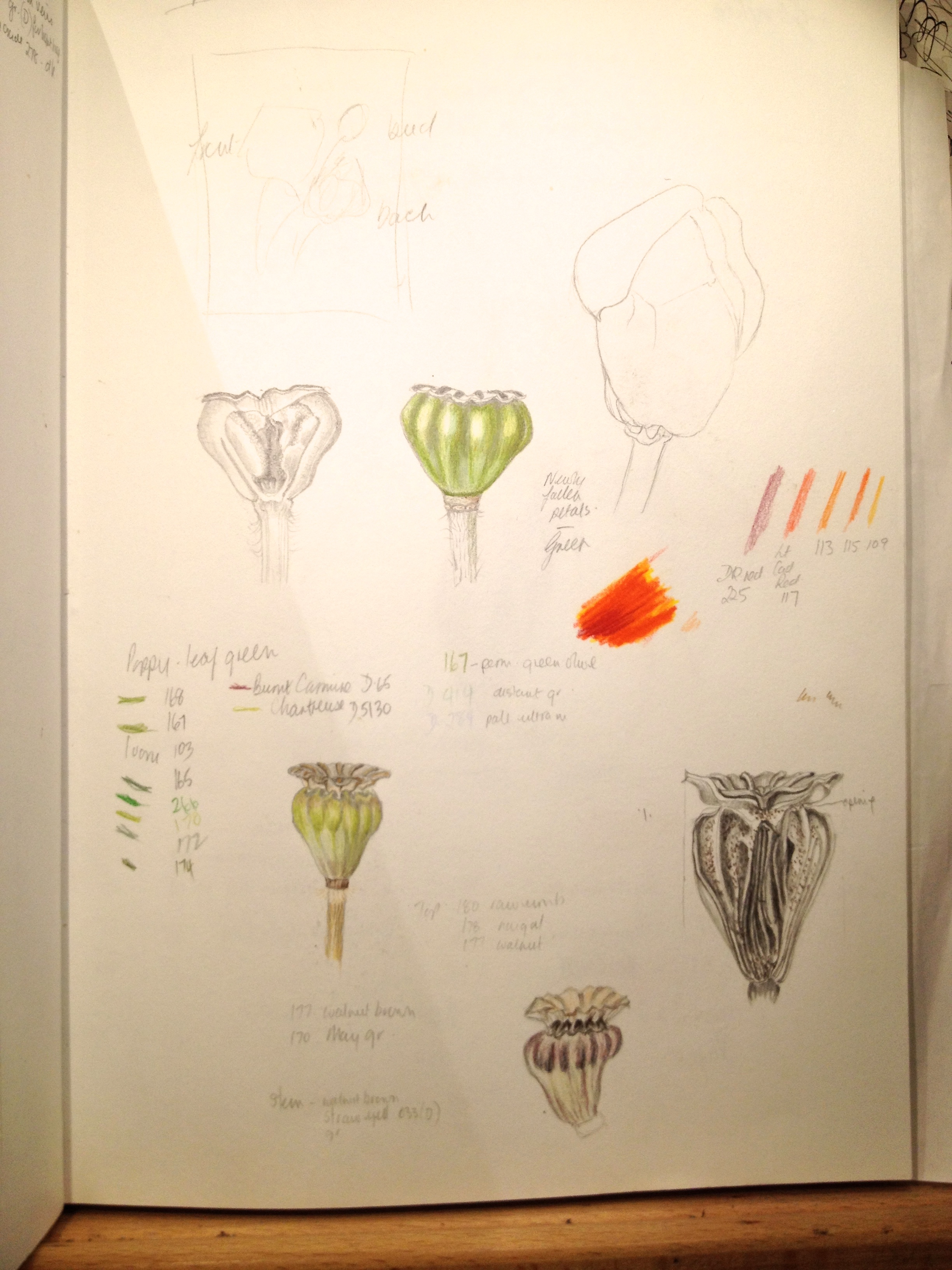
In the spring last year I did some sketches, colour detail and size of the blossom. I had to do five other crab apple trees at the same time and, during a ten-day period. This year I did dissections of blooms from the same trees and preparation sketches of the dissections to include in the pictures.
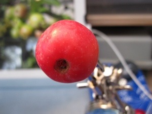
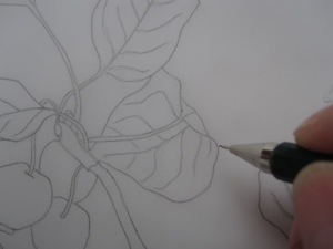
Going back to the Malus Gorgeous specifically, this summer I planned the composition and sketched this out on my final paper. I used elements from various pictures I had taken of the small tree. Bearing in mind that the apples were not full size and far from ripe and the finished painting was to include ripe fruit. The photographs were and are only a rough guide. This is the photograph I used for the main bunch of fruit.

I had to enlarge the fruit slightly to the size they were likely to be when ripe, allowing for the fact that even this allowance might be slightly out. I had measured the ripe fruit the previous year so had a good idea of the size. I then started painting the leaves.
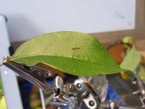
I picked the leaves I intended to paint, one at a time. None of them the ones in the photo. Some were more interesting than others, but I had to make sure that the leaves I picked were the ones arising from the fruit spur. These were the type I had included in my picture, and not those born on new shoots, as these are more leathery and differ quite a bit.

I positioned each leaf as I had sketched it in my composition and painted it into the picture until most of the leaves were in place.
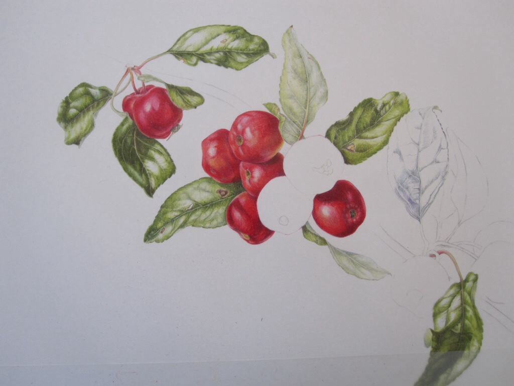
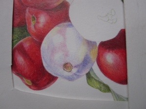
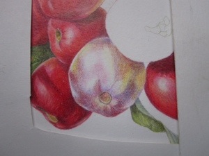
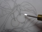
I have been doing the same with the apples. These are this years ripe apples. They have started falling off the branches, therefore I had to get on and paint them whilst I could – particularly if I wanted the series finished to exhibit at the RHS next year. That is if I get exhibition space.

Funnily enough and, luckily, the apples seem to last different lengths of time on the trees. But there isn’t much in it, so I have to plough on until all the apples are finished.
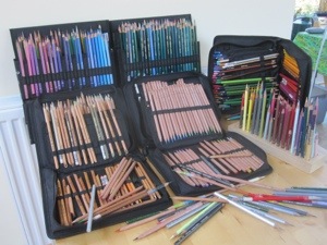
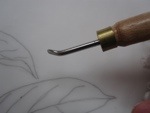
Some of the pictures of the apples being painted – with coloured pencil used dry in case anyone was wondering.


![]()

Today I managed to do all the apples. I have a couple more leaves to do and then have the dissections and branches to put in the picture. But that won’t happen yet as I have to catch up on all six pictures. The sketches Of the dissections that I have in my sketchbook will give me enough information to do this at a later time. Don’t forget that once everything is in place it has to be tied together with shadows etc in the right places.
As you see I do use photographs in botanical art, but every element in my pictures are painted from life.
By the way, comments or queries are very welcome.
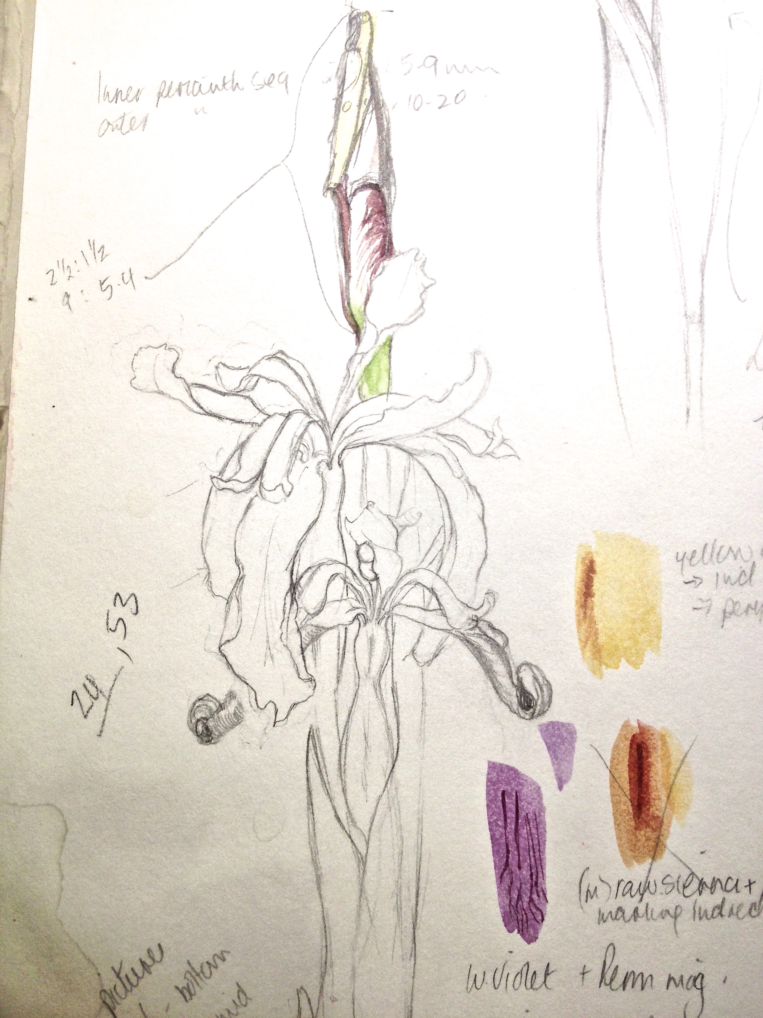
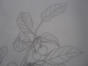
My sketchbook page.


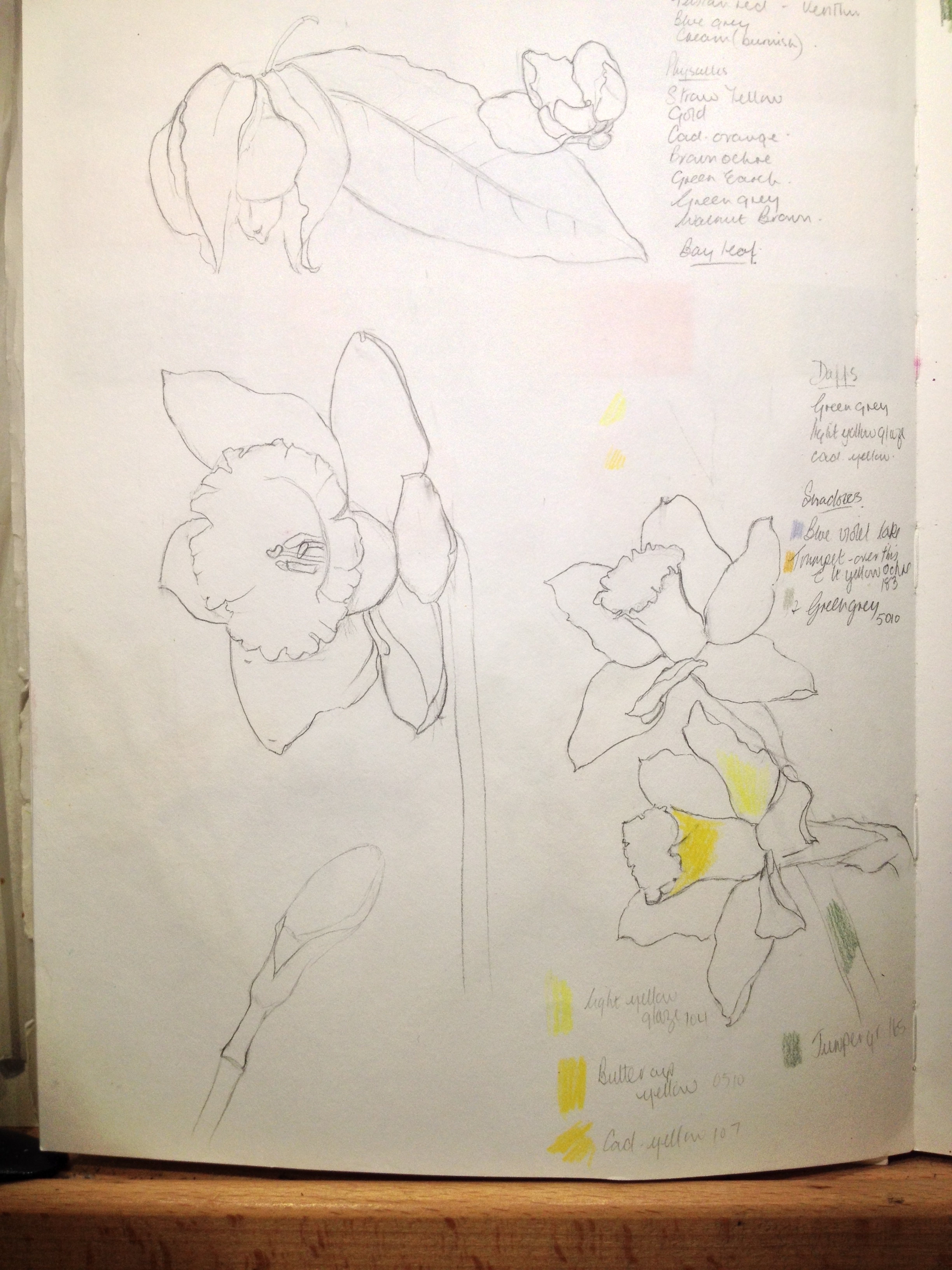 Daffodils from sketchbook