Planning the artwork
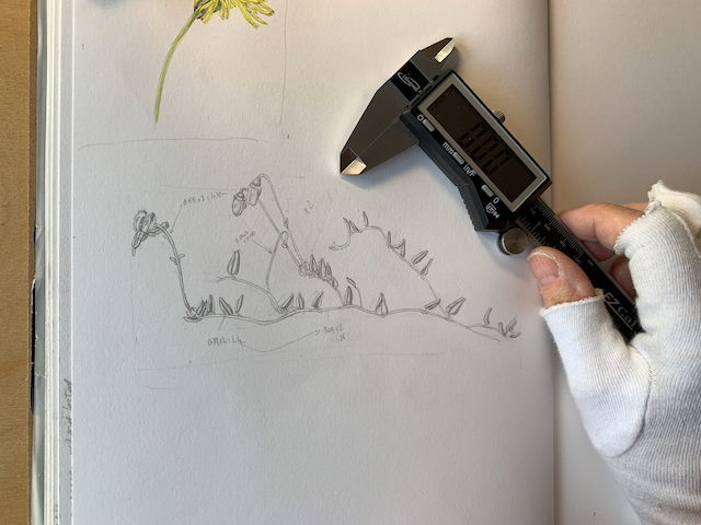
I began sketching the Vaccinium oxycoccus subsp. microcarpum (Small cranberry) in August 2018. The measurements of the tiny details were done using my trusty and accurate digital callipers.
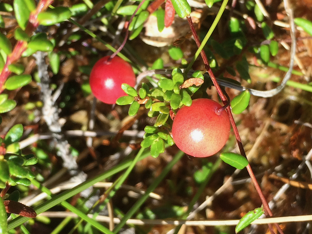
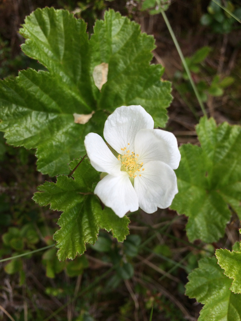
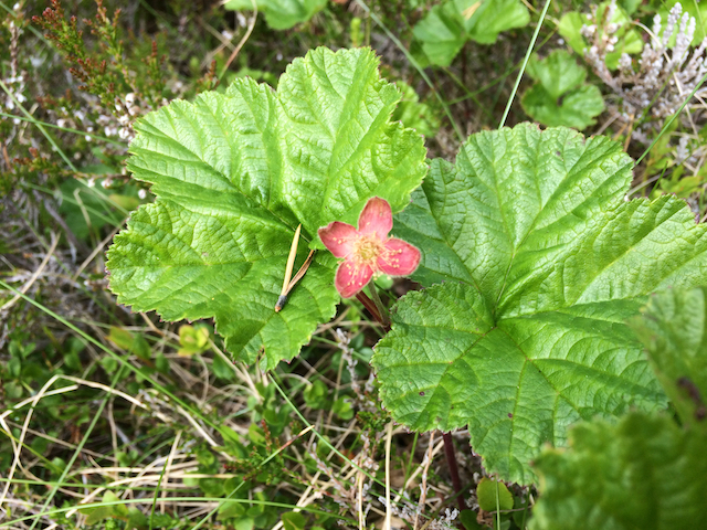
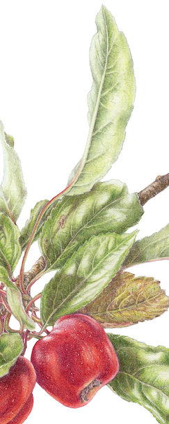
Everything about the plant is tiny – except for the fruit, which is about the same size as a bilberry 5-8 mm.
When I first saw the plant and fruit meandering through the top of the moss, I couldn’t believe that such a slender plant could actually bear the weight of its fruit. As it happens, it doesn’t as everywhere I looked the fruit was either lying on top of the moss or supported by other structures in the marsh. The stems are so tender they are smaller than a blade of grass.
As with each of the other pictures I chose which sketches I would utilise from my sketchbook and arranged them with the help of the computer. I made continual adjustments to all of the plans so that visually they would appear as one exhibit.
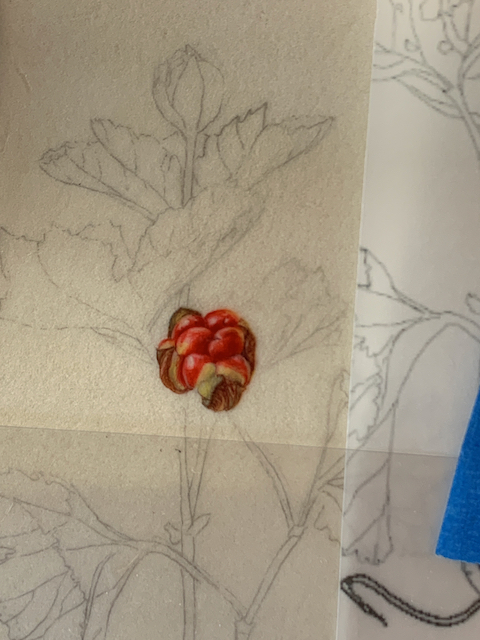
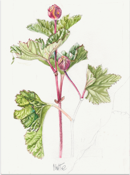
Can you see some of the parts sketched in the final artwork?


Each picture in the series was to hang ranged according to habitat from boggy and wet to sandy and dry.
The small cranberry was intended to start off the boggy end. But as the series has taken so long in the making, the criteria for exhibition has changed and I am allowed no more than six pictures.
Unfortunately, although completed, this picture will not be in the exhibit at the Saatchi gallery in June this year, but is still part of this series and will be treated as such in these blogs. I intend to show you all seven of the completed pictures after the judging process.
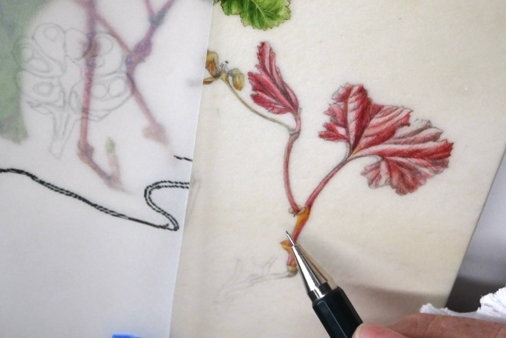
As with most of the pictures I did small trials on unmounted vellum to make sure I was choosing the right colours.
If you have read all the blogs about this series so far, you will have seen the finished trial piece in section 7, the last part of the history of the project.
The next photo is of that trial piece being worked on. I painted it twice natural size, the same as on the final artwork; you can see the flower sprig used as my model, lying on the vellum. Perhaps now you will have a better understanding of how tiny the species is.

The colours I used:
- Quin Magenta PV122
- Quin red PR209
- Perylene violet PV29
- Quin Gold PO49 (I don’t think single pigment can still be obtained)
- Winsor Blue Green PB15.
- Lemon Yellow PY175
Most of the trial pieces were painted at the cottage we rented, where I could easily source my subjects. I took over the dining table, with windows and light coming from the left. The family had to accept eating meals either outside or from a low coffee table. I was happy though!

One of the biggest challenges with this plant was the root system. I remember a comment a judge once made about a botanical art piece; where the roots were likened to something having been put under the tap!
The Cranberry roots lie in very boggy wet areas and the hair-like system seems to fall away from the main stem lying along the upper layer of moss. The hair-like roots do plunge vertically down giving the appearance of having been under a tap! The Cloudberry coming from a similar environment and often intertwined, is not like this.
During the annual stay at the cottage in the mountains, in addition to my sketchbook and painting materials I had also cut a piece of Perspex to the exact size of my vellum block. I used this to try out samples of my subject to see how they would flow naturally across the picture.

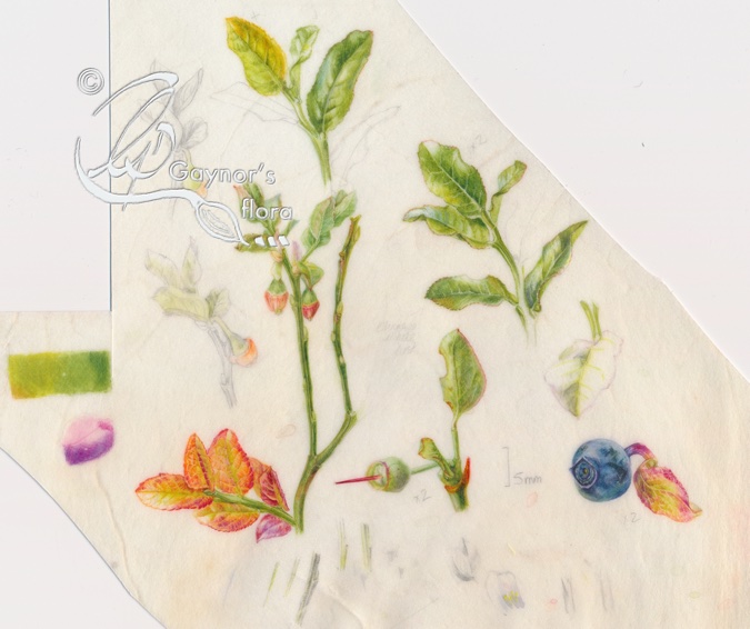
Here you see a thread-like piece of small cranberry plant together with a couple of line drawings from my sketchbook; one drawing is the enlarged section in the trial piece and the other is actual size.
Compare this both with the compositional plan above and the final artwork. The more ways one can look at composition whilst planning a picture, the better will be the result.
I started sketching the small cranberry in August 2018, started work on the final artwork July 2021 and except for scalebars, finished in January 2022.
The native range of this species is Subarctic to Temp. Northern Hemisphere. It is a subshrub and grows primarily in the temperate biome. This includes Great Britain and Norway.
Kew – Plants of the World Online
Fruit of the Forest liqueur
From Randi and Arne Christian Halseth, Skoppum (thank you)
- 500 ml Bilberry
- 50 ml Bog bilberry
- 150 ml Mountain Crowberry
- 100 ml Lignonberry
- 700ml 60% spirit
- 500 ml sugar.
- Put well-ripened berries into a suitable glass and sprinkle with sugar. The berries don’t need to be meticulously cleaned of leaves and tiny stalks.
- Top up with the alcohol. Shake well then refrigerate.
- Turn the jars as often as possible for 4 – 6 weeks.
- Strain and pour into bottles.
- Age for a few weeks.
- Enjoy
I will start the detail about the Bog bilberry plant in my next blog 14 May 2023